Clegg’s Pest Control
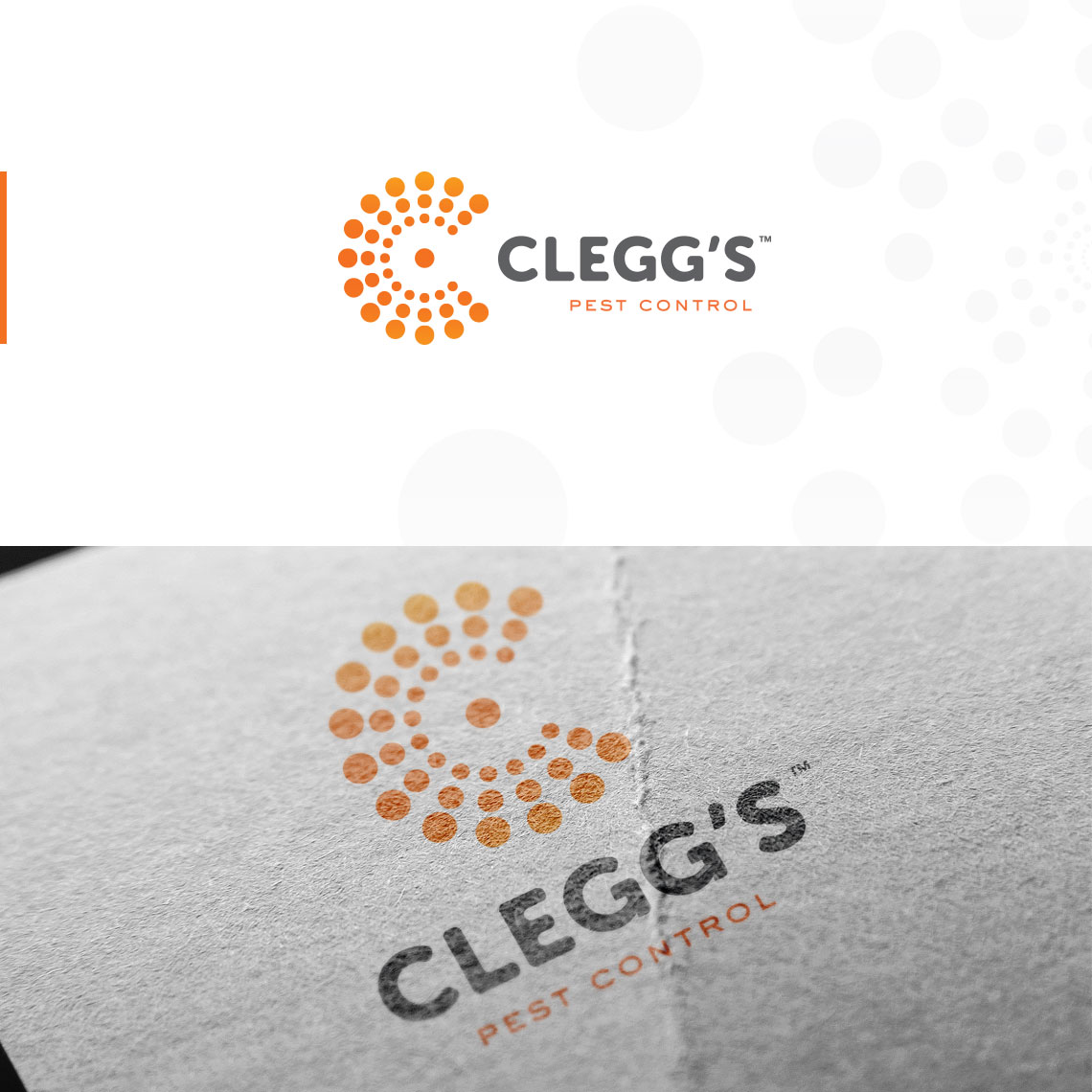
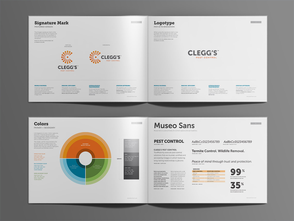
Trusted protection against pests. After a series of brand workshops, this brand essence became the foundation for a complete rebrand. The project included designing a new signature mark and a fresh brand identity. We shifted their logo from an aggressive-looking red military tank to the shape of a “C” with a centrally-placed dot. The dot resembled the core of their business – the customer – and the surrounding shapes protection against pests. We shifted their primary color to orange to make them stand out in an industry full of reds, blues and greens.
Hats worn: Branding, Concepting, Wireframing, Prototyping, Visual design
Created at COCG Agency


