Biscuitville
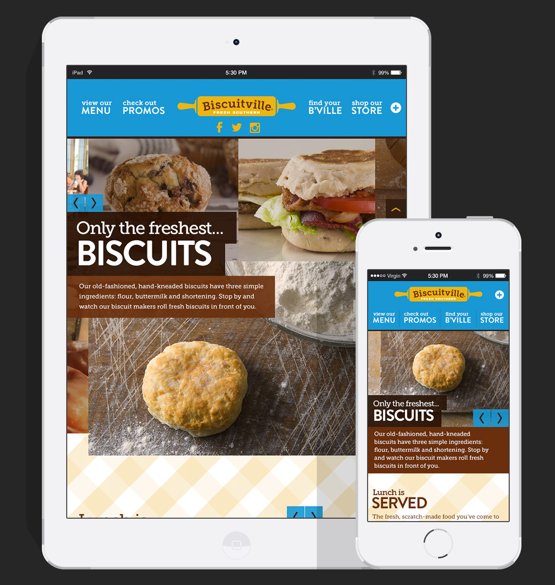
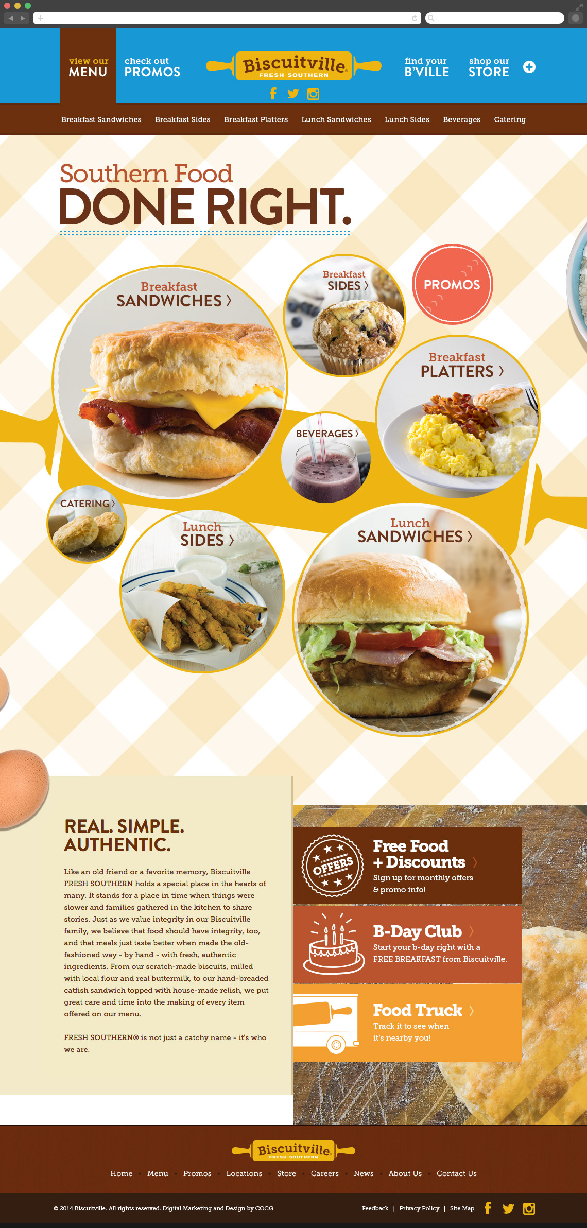
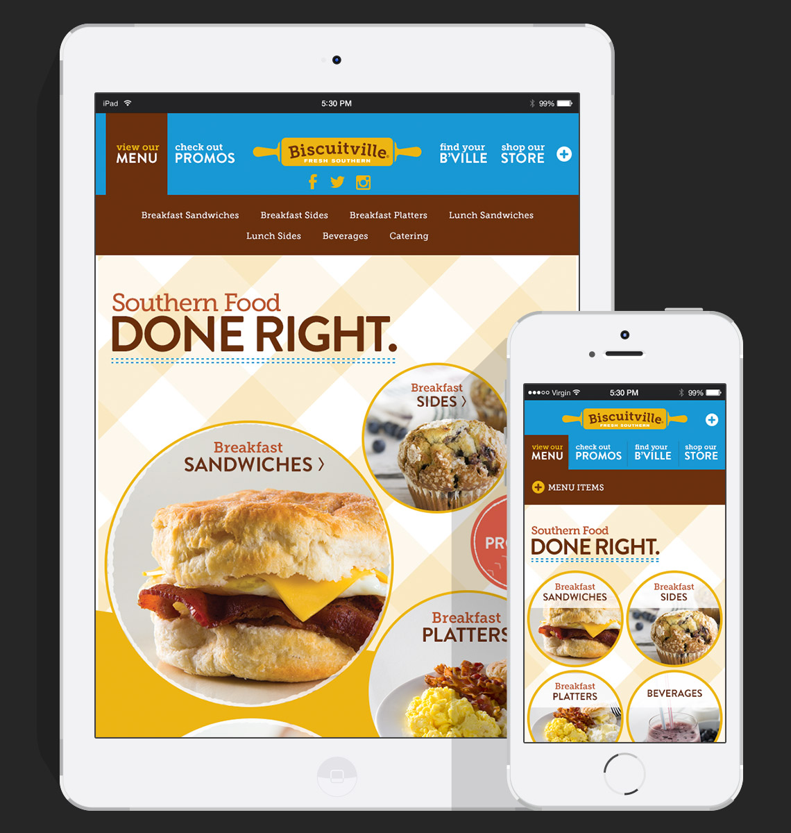
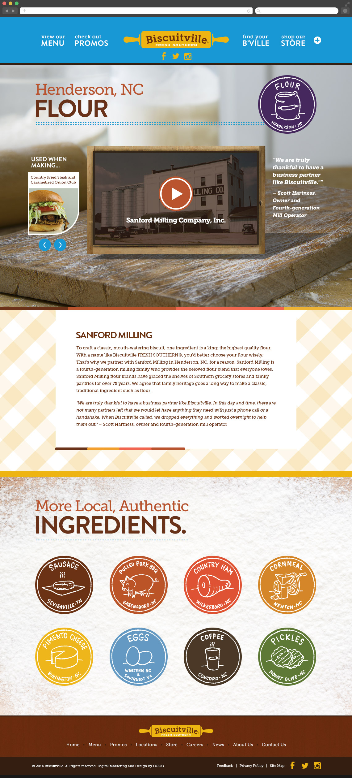
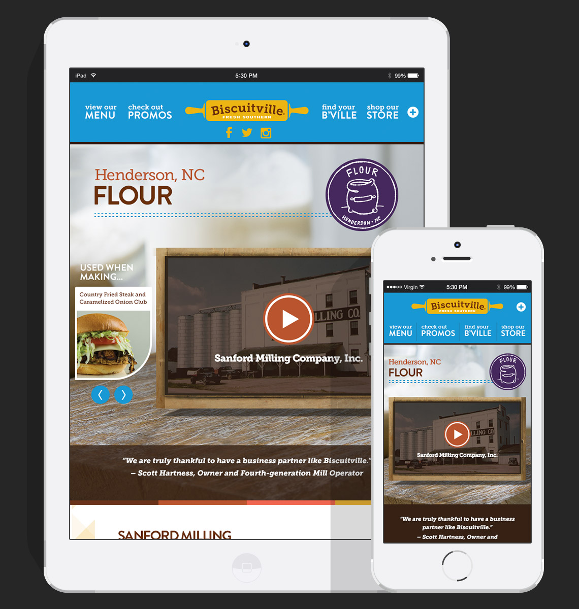
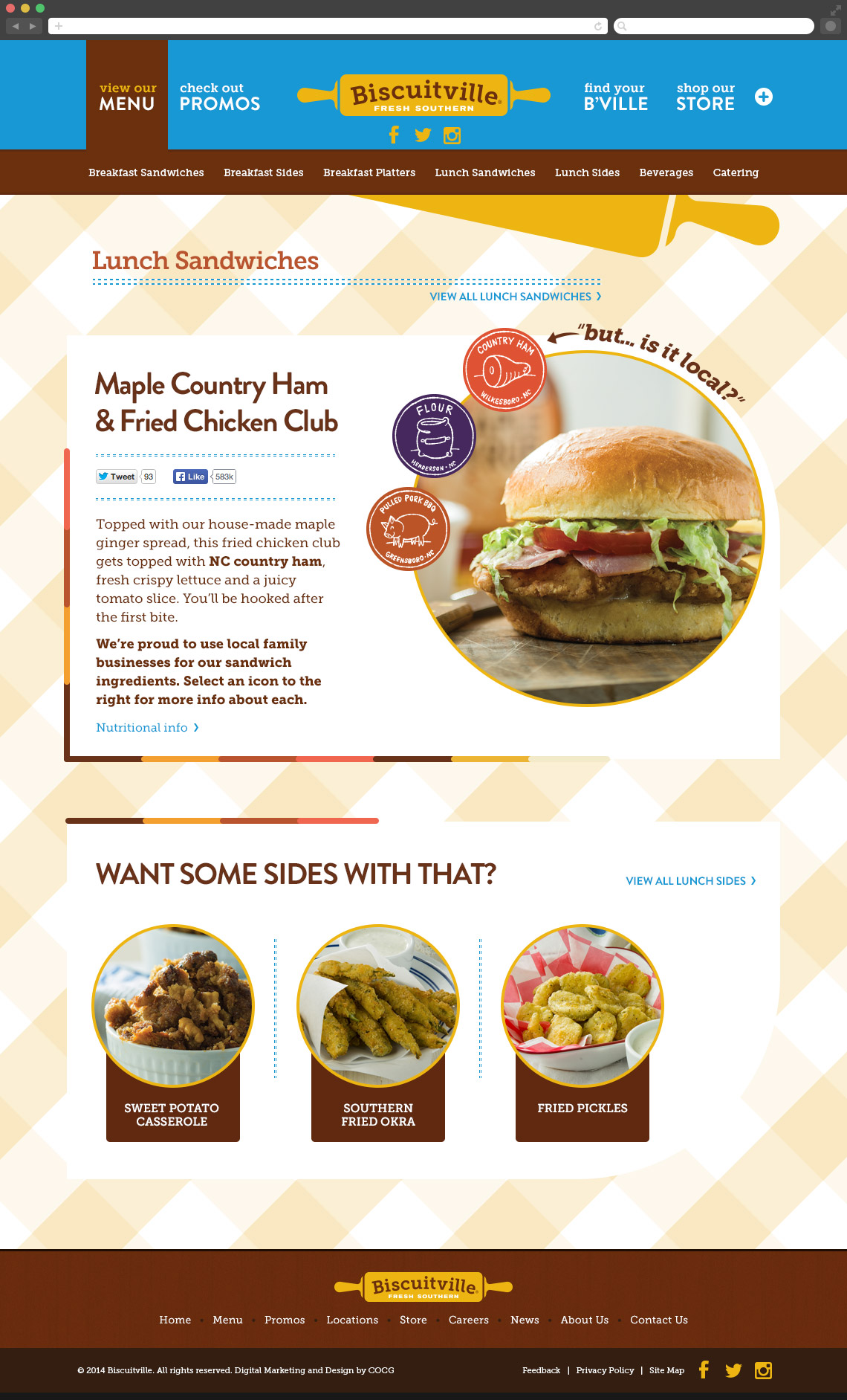
Biscuitville was rebranding, and part of the project was its online presence. The site was designed to fit their fun personality and emphasize their local ingredients, local vendors, and new lunch menu. The home page features multiple sections with a vertical nav bar (on the right) that aids in navigation by keeping track of where the user is on the page. In addition, subtle parallax features were added on the sides to create a more fun experience. Take a look at the menu page, and try not to feel hungry…
Hats worn: Research, Concepting, Visual design, Animation
Created at COCG Agency

