Command Center
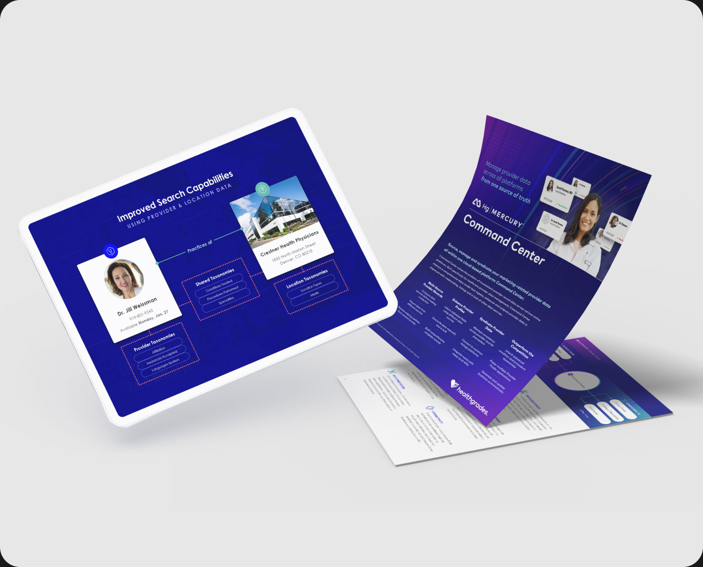
About the project // You Google a doctor and find her office address but it’s missing a phone number. So, you search for their website and once there, you see it has a phone number but the address listed is different than Google. It’s frustrating yet all too common. This is why we built Command Center.
Hats worn: UX research, UX design + strategy, Prototyping, UI design, New user guidance, Business development support
Created at Healthgrades
-
Defining the problem
It’s hard for health systems to keep their medical provider data up to date and consistent across their websites, credentialing systems, call centers, social media and many other places. Often it’s because they’re stuck maintaining data in multiple systems, which results in conflicting information when consumers and patients engage with them.
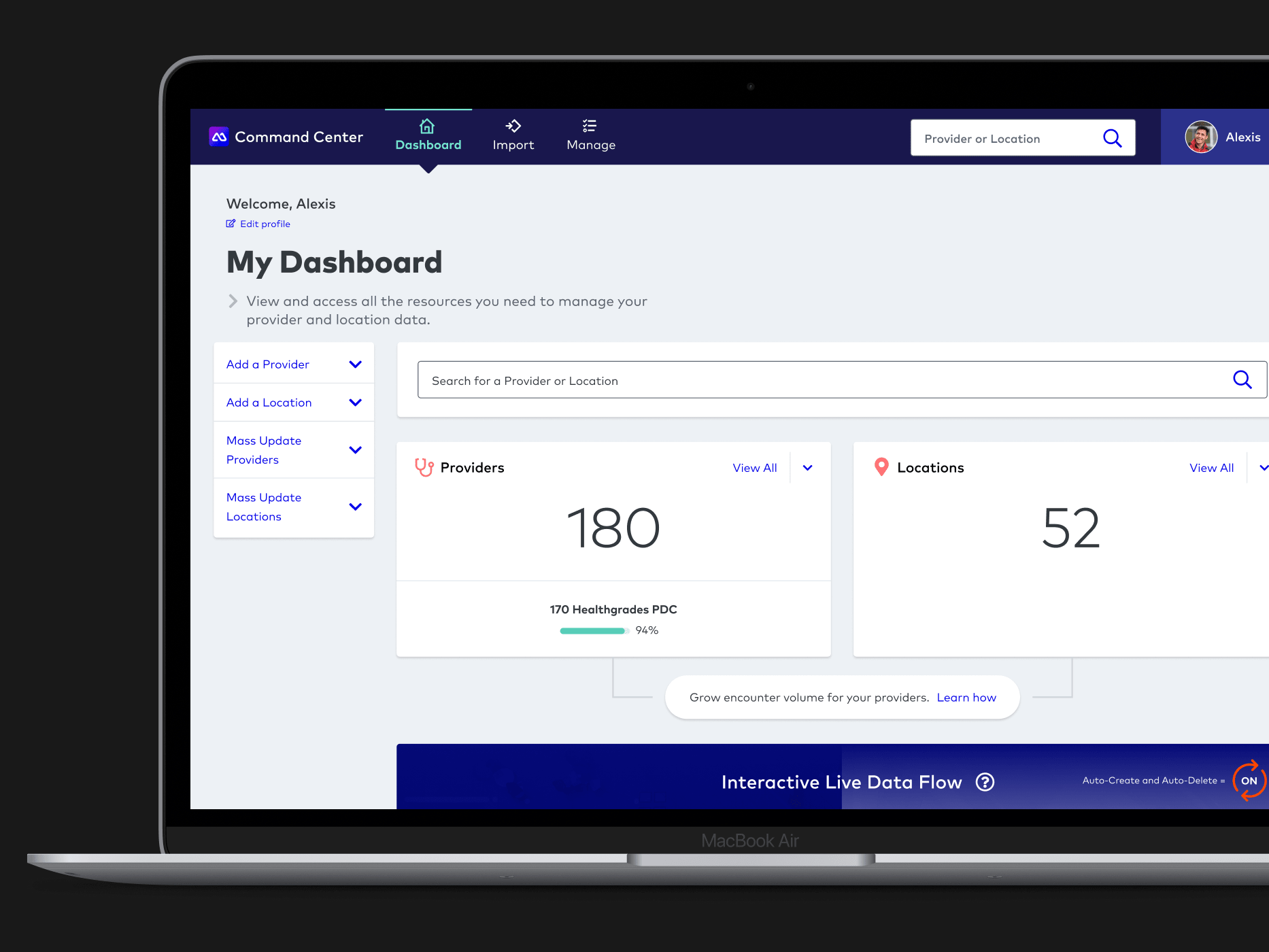
In response to this problem, the idea was sparked for building a web app to serve as the single source of truth for provider data, with a primary focus on fixing the bad data consumers use when searching, comparing, and selecting a provider. As the UX Lead on the project, I led the product’s research and design at inception, collaborating with the Product Manager, Developers, and other team members for product UX strategy and build.
Understanding needs and challenges
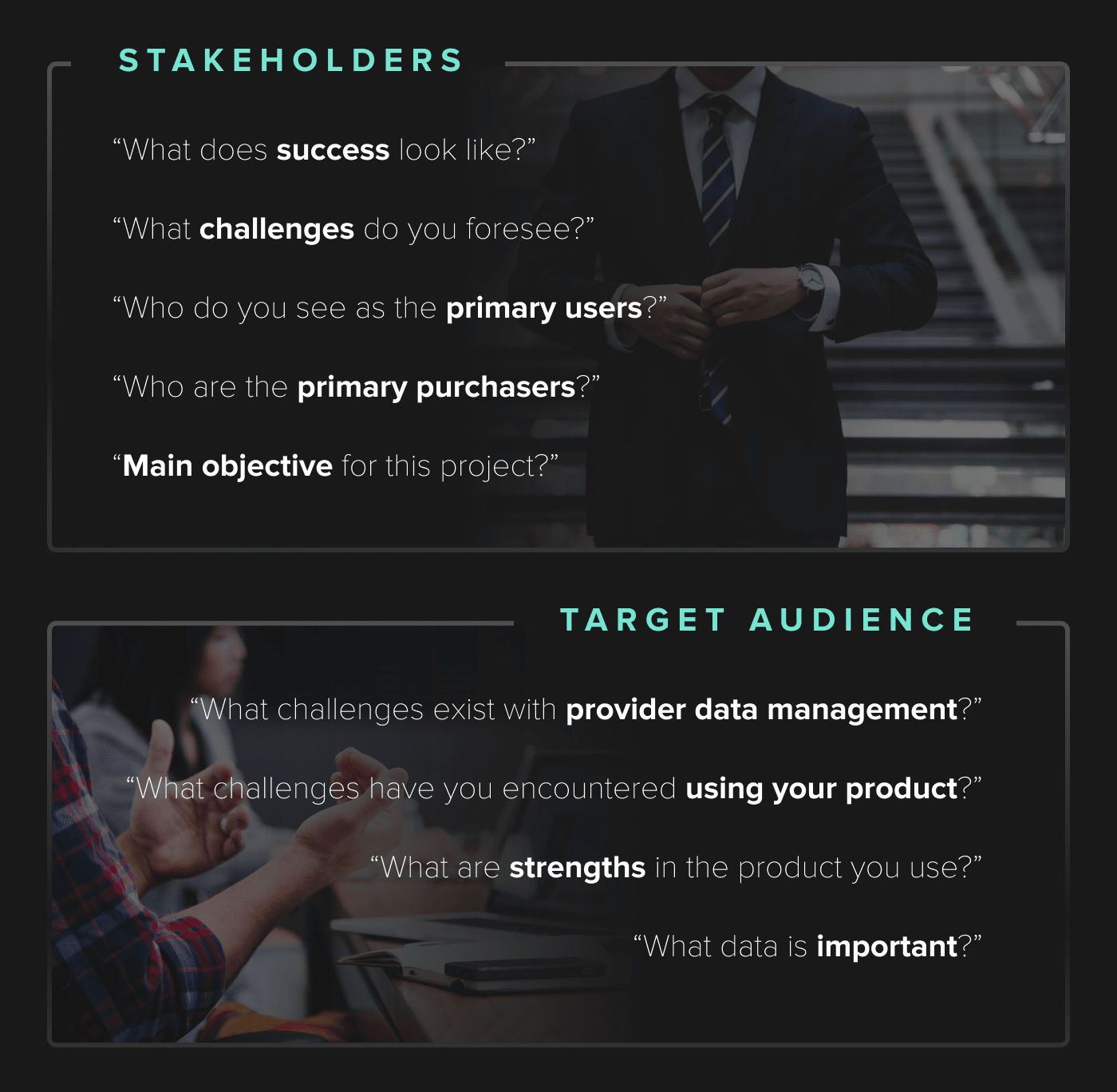
We interviewed internal stakeholders, including the company president and senior VPs, to understand leadership’s product vision and business objectives. Through that process we identified common themes for critical product features and how they viewed the product integrating within the company’s application suite.
We also interviewed clients who were using other company products and were in roles which we were targeting, in addition to interviewing some fellow employees who had recently worked in those roles. Through this process we gained valuable insights about their needs and challenges plus valuable insights about competitor products.
Narrowing focus
Our user research provided guidance for where to focus and how to position the product. We wrote stories for the key user flows including some of the main features like syncing incoming provider data and enhancing data.
Over a few intensive days we workshopped ideas for the tech stack, product integrations, and priorities. We identified key differentiators which helped inform the product’s sales story and value proposition.
Designing for real people, not machines
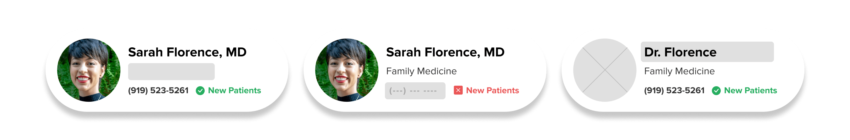
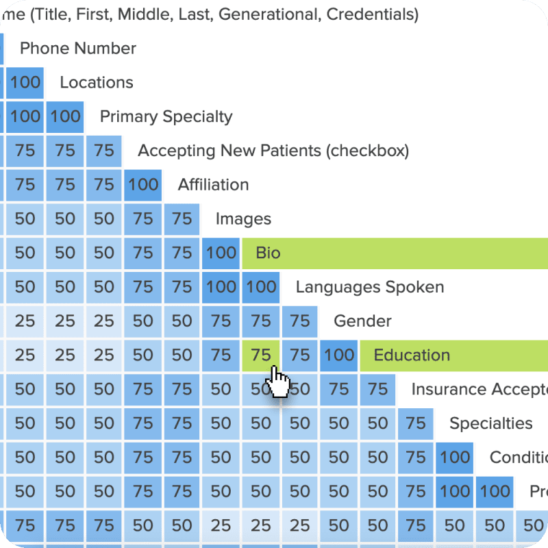
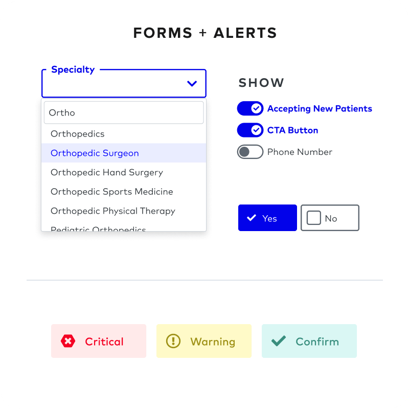
Command Center’s MVP design was completed quickly, with frequent user research during the process. Moderated usability tests uncovered problems with some of our labels and UI elements, while card sorting studies with target users helped us refine the product’s architecture and nomenclature. Among those learnings was how to best organize provider data fields on edit screens.
Building a scalable design system
The UI was created to be flexible and work across business-critical devices, with a focus on desktop users as the primary audience for the initial version. Elements were designed to be modular and recognizable, to make new user adoption easier.
Supporting new business development
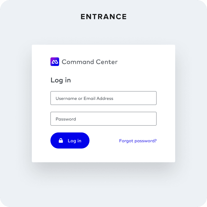
As part of the product launch, I collaborated with the Digital Strategist and Product Manager to develop business development materials including sales presentations, sales sheets and a fully-functioning demo environment of the product. This demo is kept up to date with new features and is integrated into the product demo of the company’s full application suite.
Configuring onboarding and analytics
We’ve leveraged the use of Gainsight PX for user onboarding, training, user feedback, and analytics. Working closely with the Digital Strategist and other product leads, we developed a strategy for implementation and priorities for the onboarding experience. I pioneered and championed its integration for Command Center and supported the adoption across many other products in the company. We now use the analytics data for UX benchmarking and to guide feature and UX decisions.
Continuous improvement
As we continue to improve the product, I lead the research and design of new features and enhancements.
Here are some recent enhancements:
Bulk Sourcing and Syndication
After learning about the steps users were taking to bring in their data, we made it easier to edit where data feeds into Command Center for every field on every doctor record. This can be done for just one record, several records, or even all the records in the system. And for outgoing data, it’s just as easy to turn that switch on or off for one, multiple or all records.
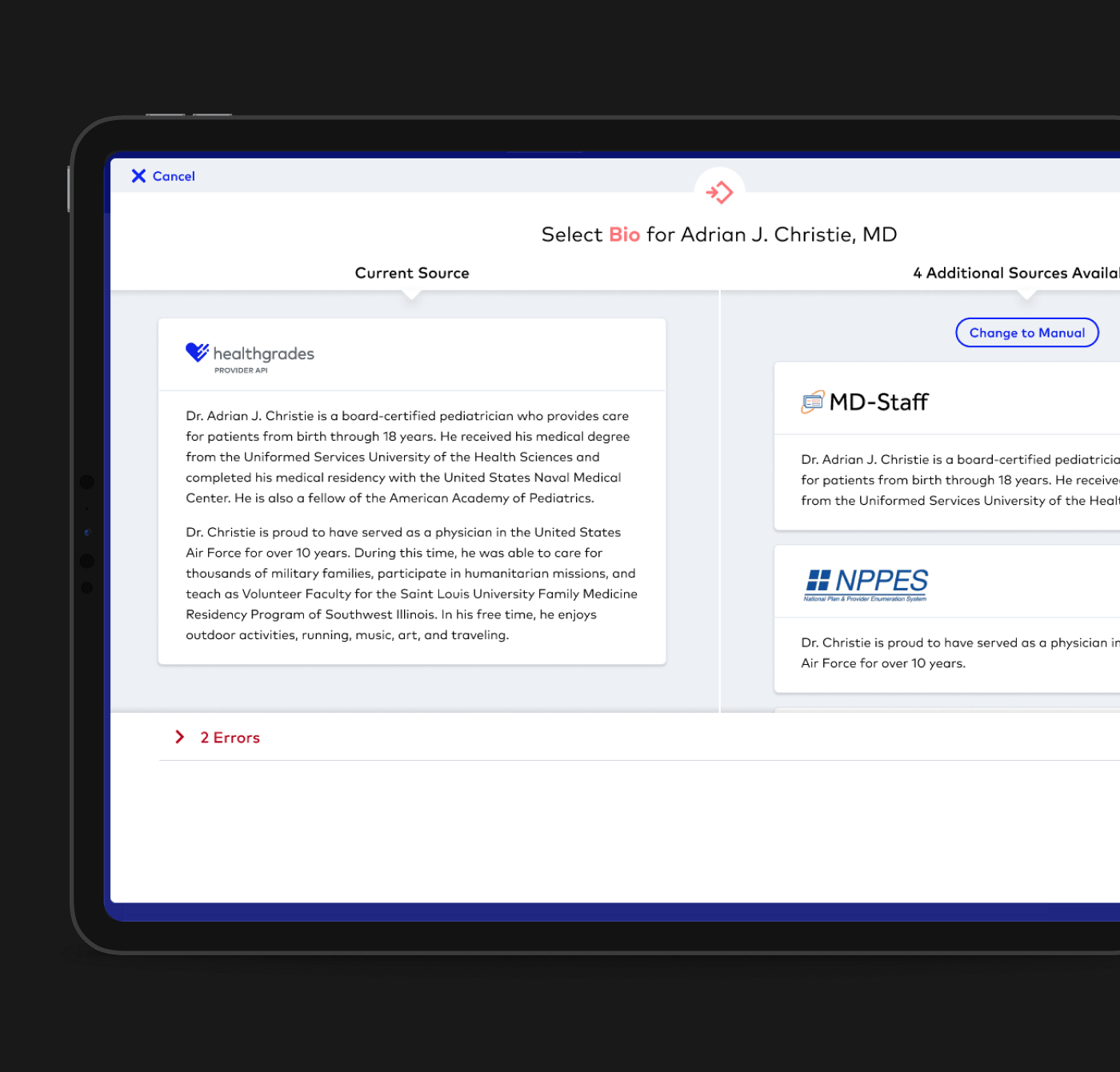
Data Comparison
One challenge that existed with bringing data into Command Center was that the data for each field was a mystery until after it was imported. This feature allows users to visually preview and compare incoming data for a doctor record, per field, before they choose to import it. This makes the decision for which data source should feed each field incredibly easy and fast, and – most importantly – provides confidence to users that they’re choosing the best option.
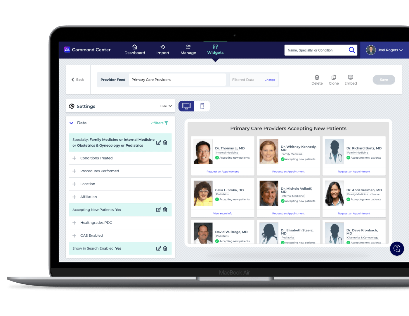
Widget Builder
One of the primary audiences for the product was healthcare marketing directors, many of whom have limited technical knowledge. As a result we developed the widget builder feature with the ability to create pre-styled, decoupled widgets for provider feeds and provider search. They are easily customized, both the data and styling, and the embed code allows them to place it anywhere (ie. website page or mobile app). Updates and changes are done live so managing the widgets is streamlined.
Videos showing process of building:
Watch Provider Feed
Watch Provider Search