DX Engine
About the project // Between 2018-2021, many large health systems merged and others acquired smaller hospitals at an increasingly rapid pace. As a result, health system marketing teams needed to adapt to managing much more digital content with sometimes decreasing budgets. This created a demand for a healthcare-specific enterprise website solution that was scalable and customizable for multiple brands but won’t break their budgets.
Hats worn: UX research, UX design + strategy, Prototyping, UI design, Business development support
Created at Healthgrades
-
Market Research
To validate our hypothesis of market demand, we met with healthcare clients already using other Healthgrades products, several who expressed needing new enterprise websites. However, they could not pursue the need because of the high cost to build. Herein was the problem: newly-merged and growing health systems needed to re-build their sites on scalable, customizable platforms, but the market’s existing enterprise-level solutions were expensive, took very long to build, and sometimes promised more customizability than was actually delivered.
Our product team had already built and was maintaining a healthcare website builder “lite,” used by scores of clients for hundreds of small, specialty-focused websites. However, it lacked key features and architectural requirements for clients to use the tool as an enterprise-level solution. With the market demand established and growing, we spent a week workshopping ideas for how the existing product could be evolved to meet the need.
User Research
In addition to the health system marketing team leaders, there were two additional key audiences for this product. First, the end users of the websites including patients and their family members, whose brief interactions needed to be efficient, clear, and frictionless. Second, the website content managers, who would be spending many hours using the admin area of the product to edit and optimize content.
I used a combination of quantitative and qualitative research techniques to better define these audiences and understand their needs and frustrations.
End Users
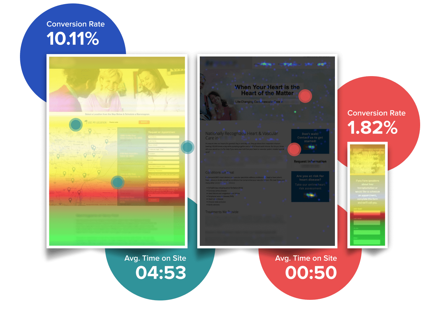
This audience included a wide array of existing patients, prospective patients, and family members (or decision-makers) who would interact with a health system. In addition, they were from many different types of cultural backgrounds, levels of technical savviness, and ages. In order to work within budgetary and timeframe constraints we leveraged aggregated analytics data across multiple “lite” sites to get an understanding of their actions and workflows. One of the key insights we learned was the ideal placement for primary actions, both on computer screens and on mobile devices. We also discovered how far most users were willing to scroll to find their desired action before abandoning the page or advancing forward. These plus other insights helped inform design decisions for the new product.
Content Managers
The second audience would be spending many hours managing content on these sites. I interviewed 8 people – six designers and two team managers – who were already in the role of creating and managing content for “lite” sites. The purpose of these interviews was to understand how well the existing product’s functionality, configurations and options supported their needs. We also wanted to hear if problems or gaps existed and their suggestions for how they could be improved.
Mapping Insights to Features
With a better idea of what was needed to be successful, I compiled insights that highlighted gaps, opportunities, and recommendations. For example, every participant interviewed repeatedly accessed the same site admin sections. My recommendation was to add shortcuts to save them multiple clicks. Another key insight was their frustration by the lack of control over colors. My recommendation was to expand the color controls to better support variations in health system brands. However, I also discovered that some existing functionality (a color wheel picker) was rarely used by some and never used by others. As a result, while we expanded the control of colors for better branding control, we also removed the color wheel tool which decreased scope for ongoing maintenance.
Building the Builder
I worked with the development team and the product manager iterating through concepts for the new product. After narrowing the focus on the features that would meet the primary needs of our audiences, we set to designing and building them. This process involved design feedback sessions and co-design workshops. I maintained frequent communication with the developers so I could get feedback on design concepts quickly and they could get my review/feedback quickly on components as they were coded.
We looked at the various page layouts commonly used in the “lite” sites and audited other health care sites to understand additional layouts that would be needed. From this we built a flexible, responsive grid system into the product in which a user can choose the number of columns in a row and place content sections within that grid.
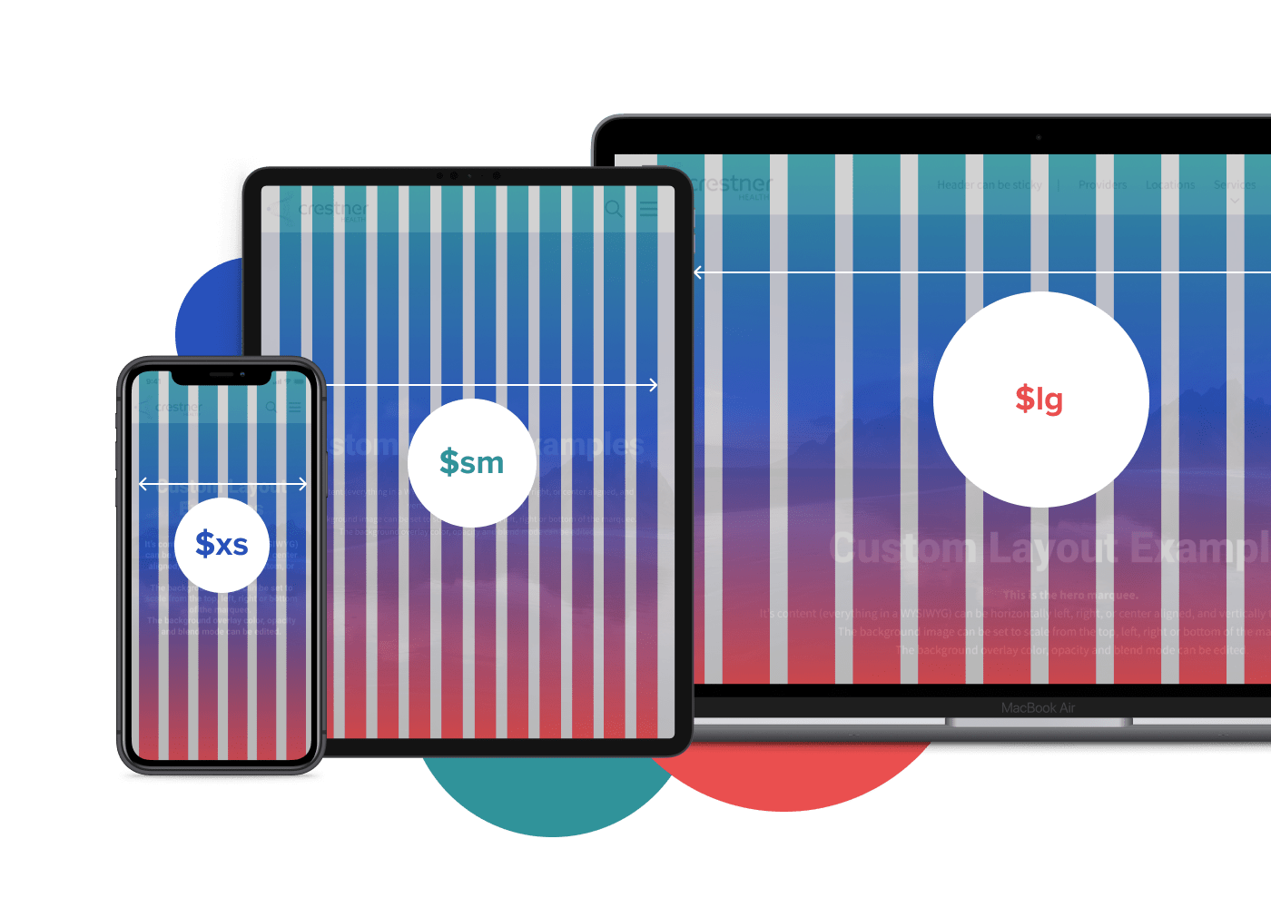
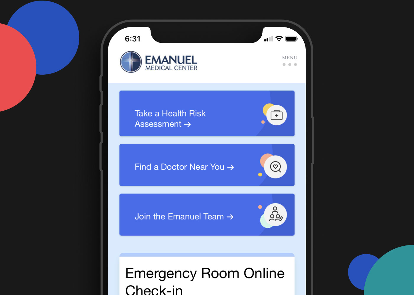
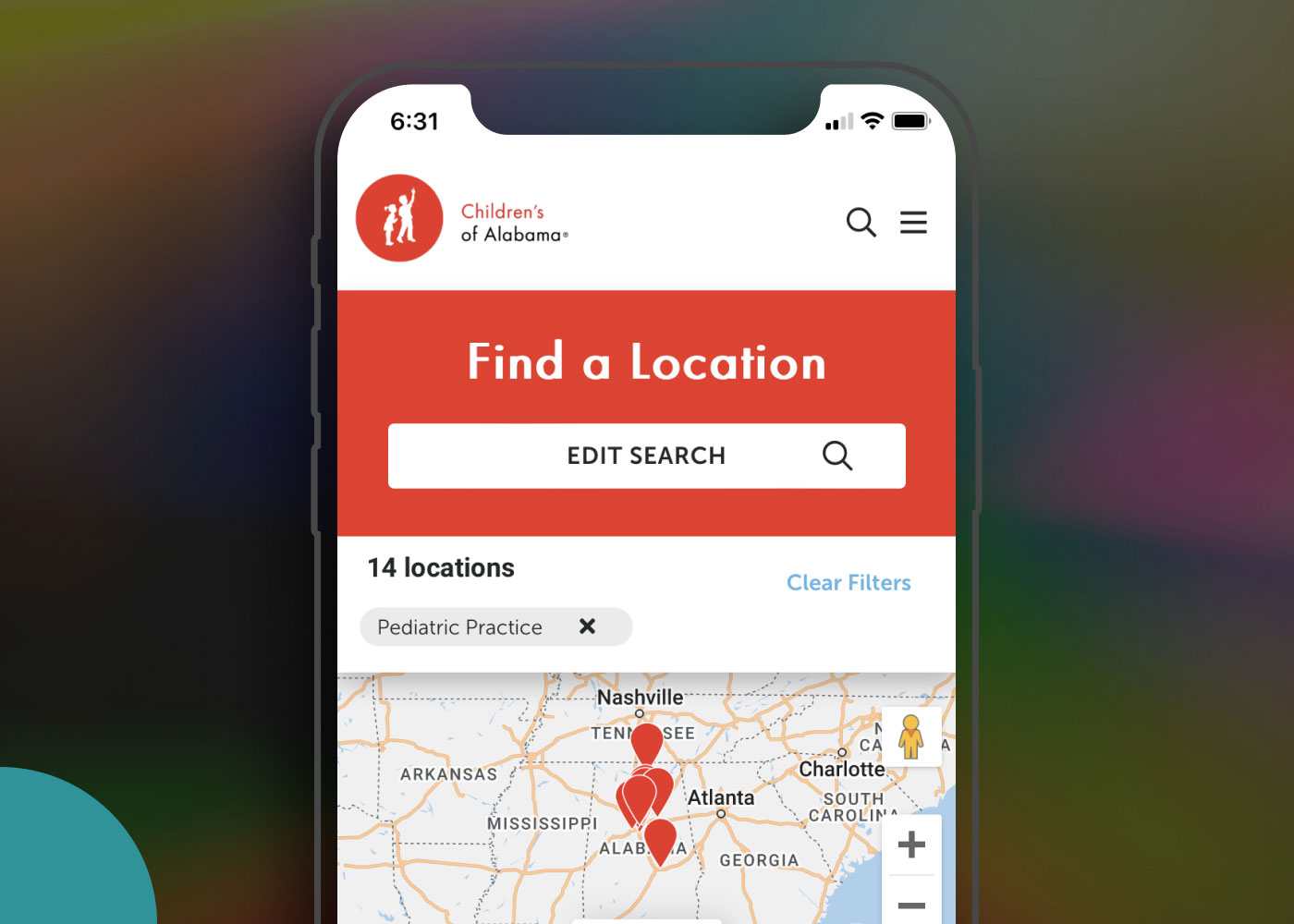
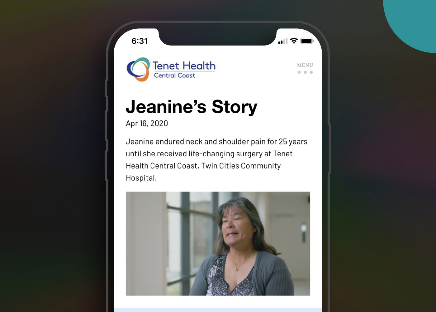
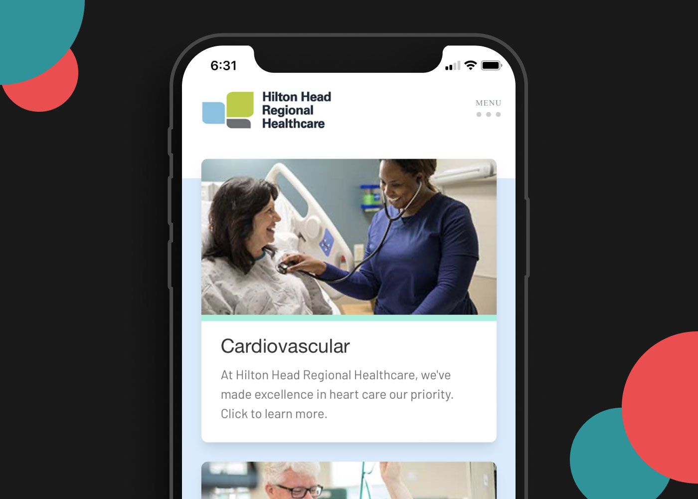
We built a customizable library of components – both small and large – including buttons, headings, multiple versions of cards, marquees, and many more, and all of them allowed specific properties to be customized with a client’s branding. Details like square versus rounded corners and full-width images versus constrained to a maximum width were all part of the customizations available so that a content manager had freedom to use their creativity. That freedom was balanced with the centralized branding controls including colors and typography so maintenance of the sites were scalable and fast.
By bolting components together we created modular patterns that customized nicely with the client’s branding. They allow their unique colors, typography, and photographic styles to show through resulting in what felt very customized to them.
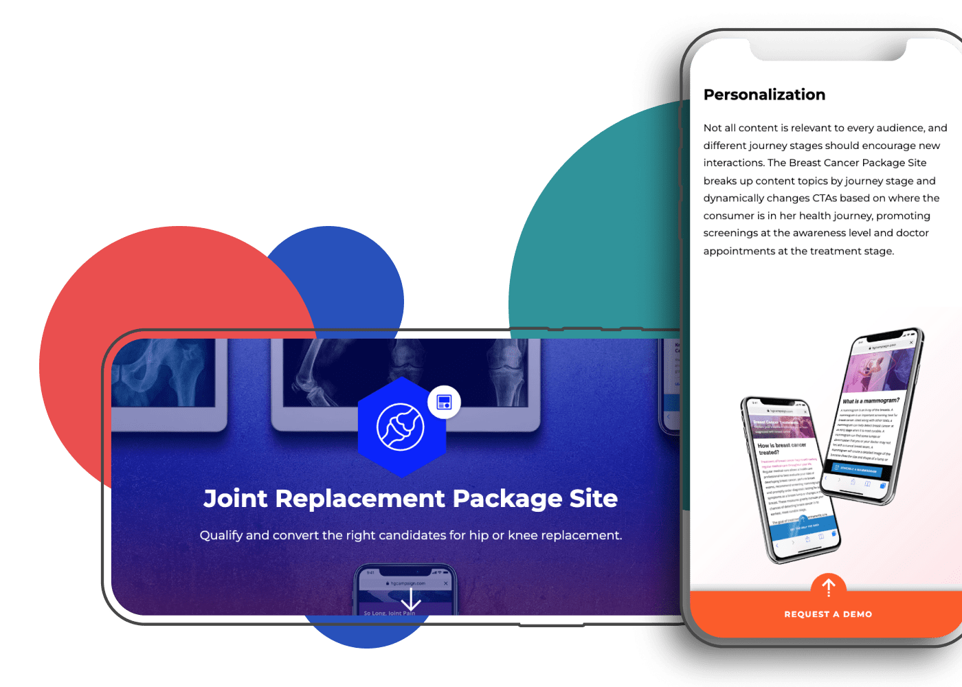
The final result was an enterprise-level product that supported one or multiple brands under an umbrella site experience and provided a much-decreased timeframe to go-live. It was scalable and manageable for large enterprise-level sites with thousands of pages of content. For example, key actions were managed in a centralized place so one change would populate across scores or hundreds of pages. It was also customizable for multiple brands so that the complex health systems whose brands were structured as a “house of brands” could efficiently use the platform. Lastly, it would not break their budgets and instead offered a lower-cost solution than most of the competitor options in the market.
Below are some real examples of the product in use. They were built in 60 days with almost zero custom code required.