Location Search
About the project // One of the biggest problems health system websites have is limited, poorly-structured and hard to find location details. This product helps solve that.
Hats worn: UX research (user flows, behavioral studies, usability testing), Wireframing, Prototyping, UX design, Business development support
Created at Healthgrades
-
A Widespread Problem
When looking for a healthcare location or doctor’s office on many hospital websites, it feels like searching a yellow pages book. Poor experiences have left users wanting a much easier and quicker experience for finding the ideal location and its details.
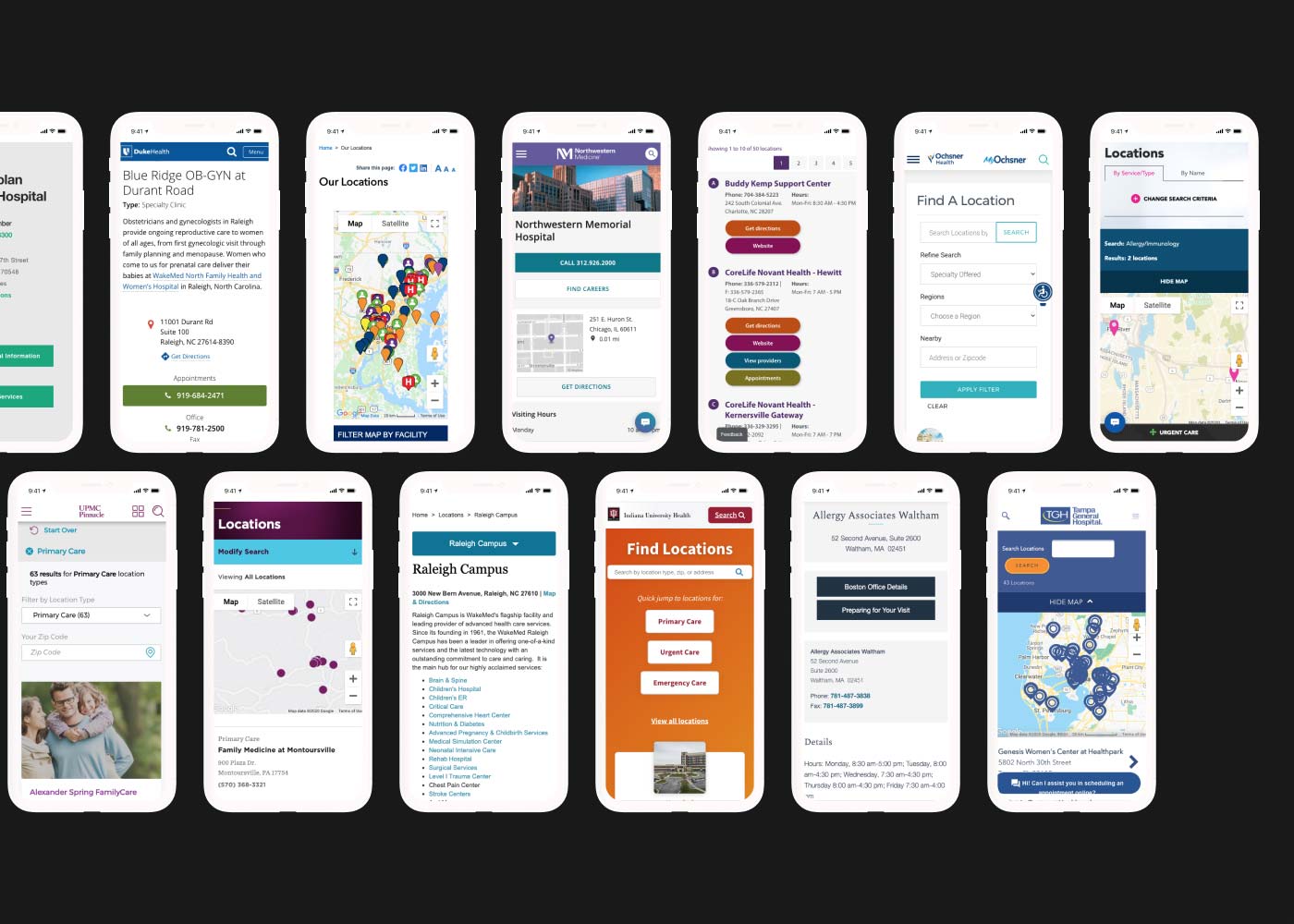
As UX lead, I chose to start by comparing the location search experiences across over 20 hospital websites, including some built by competitors and others our team had previously built. This included studying analytics and conducting lean heuristic evaluations. We discovered that even some of the nation’s largest health system websites provide a poor experience for finding location information. For example, some place their phone numbers and addresses into the sidebar, forcing users to scroll significantly on mobile to find it. We identified opportunities for a better location search experience, including streamlined user flows and more useful location data for users.
Defining Users
We identified groups of users who seek healthcare locations, identified the information most critical for them, and wrote user stories to help guide which features to build.
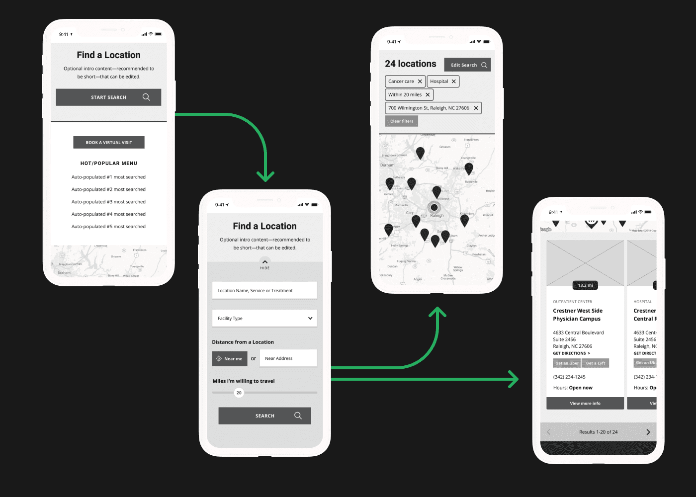
For each user type, we defined needs statements and created visual user flows, which unified the team around common goals. The primary goal for the product became: minimizing interaction cost by decreasing the steps to find the right location and its details.
A second category of users included those logging into the website to setup and customize the UI and manage the location content. These included both Healthgrades employees and client teams. To avoid unnecessary complexity for these users, we centralized the styling settings in a single screen and the functional setup settings on another screen.
The Broader Ecosystem
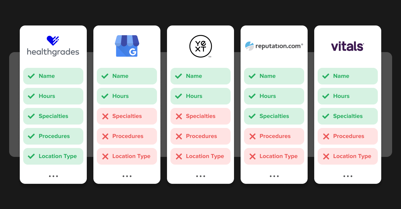
In order to make the product scalable, the location data model needed to be structured using commonly-used data fields across related Healthgrades products and other platforms. We compared the most popular ones including Google My Business, Healthgrades.com, Vitals, Yext, Reputation.com, and others to identify the ideal data model.
A Fast, Modular Solution
Having identified user needs, their workflows and an ideal data model for scalability, I set to work wireframing and designing the solution. I used a holistic, atomic design approach, crafting the small and large screen experiences in parallel, constantly checking them on native devices, while considering how individual elements would be influenced by different brands.
The result was a clean, simple search UX for end consumers with flexibility for clients to match their branding. Many of the following searches were created by other designers and demonstrate the variety that’s possible.
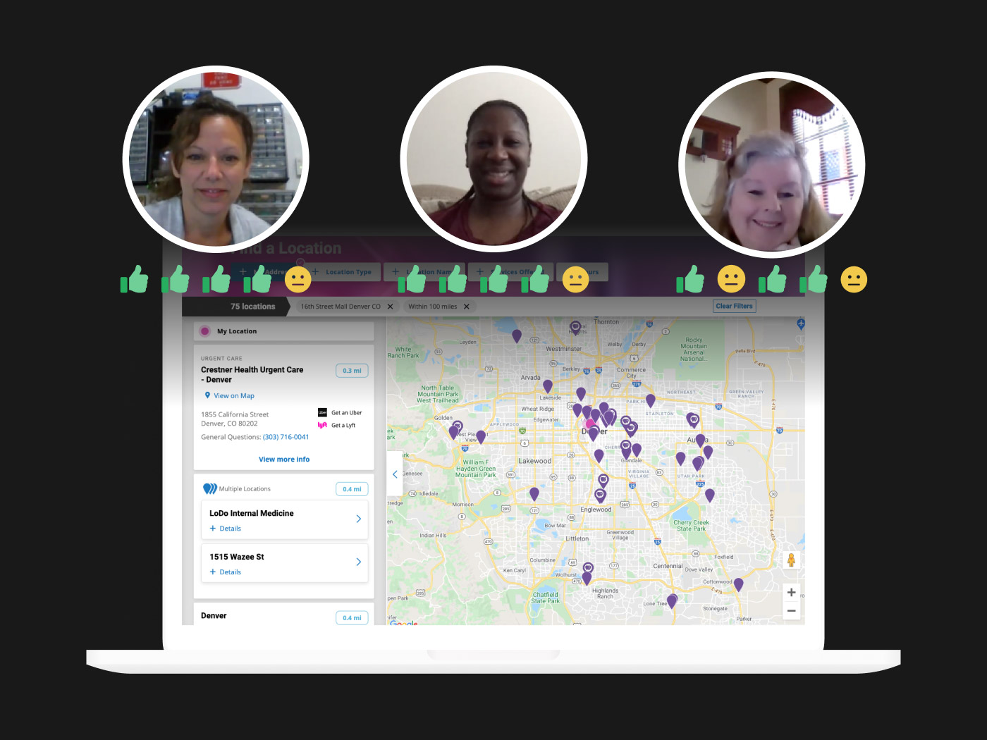
Test. Test. Test. Launch.
I led moderated usability tests to identify how well our user flows aligned with real user behavior and to assess the perceived value of the product. Results surfaced some areas for improvement which the team weighed and plotted on an Effort/Impact Matrix and implemented key feedback. Overall, the location search was very positively received by participants; some even asked how they could start using it!
As the product neared MVP, I worked closely with the digital strategist on my team to create business development materials including sales presentations, demo sites and sales sheets.