Melrose Wakefield Healthcare

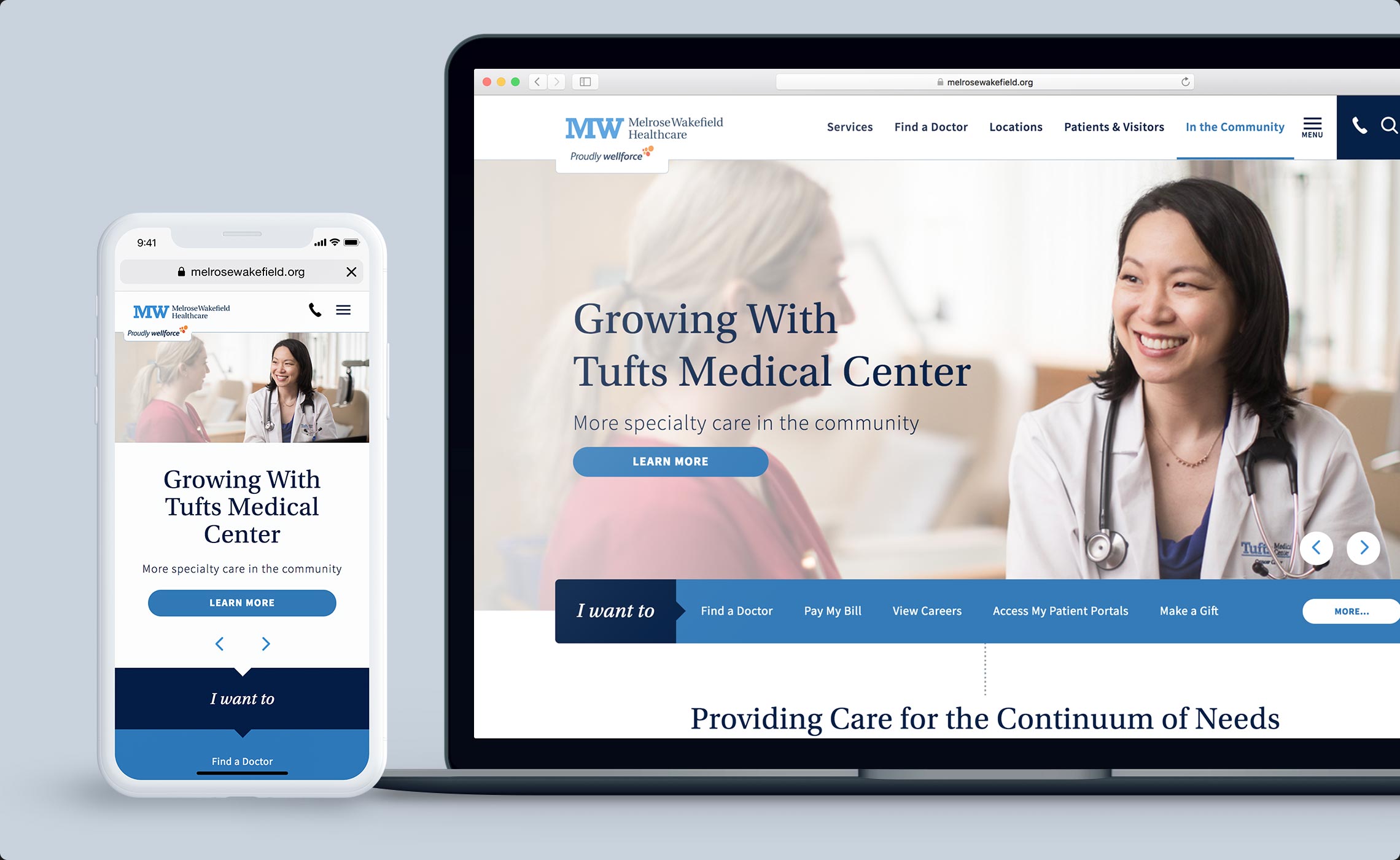
About the project // Timing is everything; especially when an organization is launching a new name and brand. This project required collaboration with MelroseWakefield Healthcare and their branding agency for a synchronized name, brand and website launch. As a growing and changing organization, they needed their website to be flexible, empowering them to manage content at scale and rapidly push out information to different types of website users.

Hats worn: UX research, UX strategy, Concepting, Wireframing, Prototyping, UX design, Content strategy

Created at Healthgrades
  • UX Research

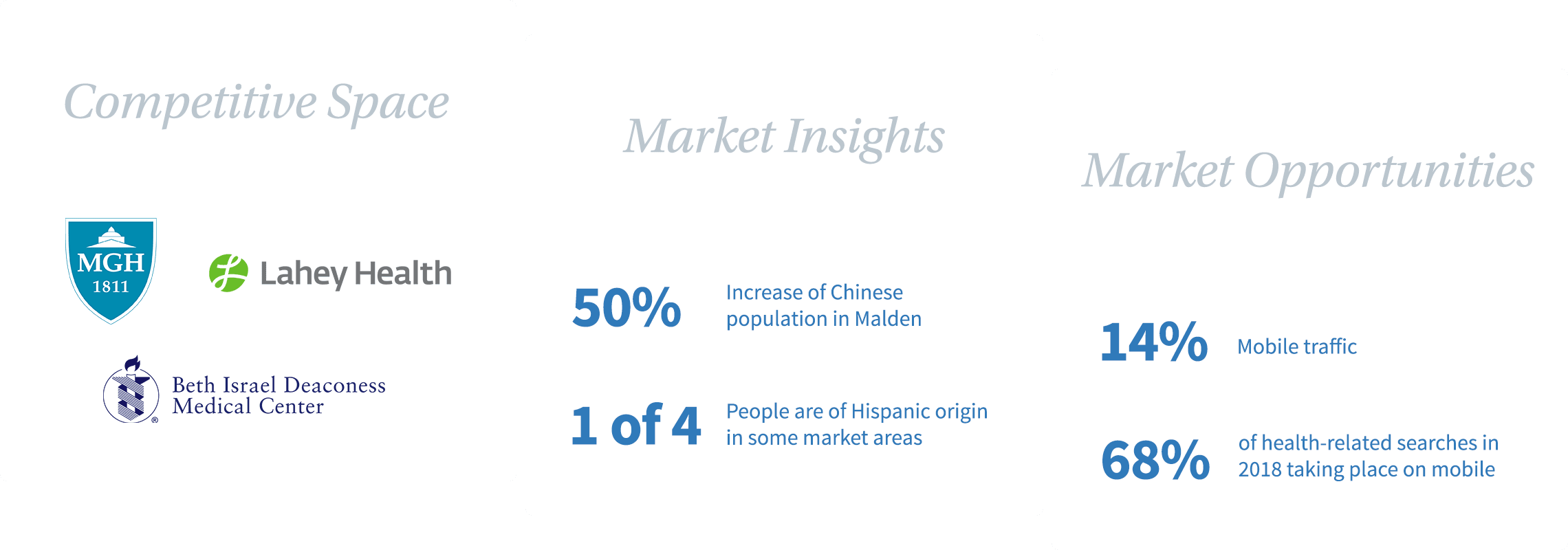
    At project start, MelroseWakefield was named Hallmark Health. Prior to starting the website project, they discovered their name had poor brand recognition in the market, despite having multiple hospitals, medical centers and physician practices. As a smaller player in the greater Boston healthcare space, they needed to reimagine themselves. Since my team was committed to focusing on the website aspect of who they were to become, we spent several weeks researching to better understand the needs and behaviors of their audiences plus the strengths and weaknesses of their competitors. This research provided insights that spawned ideas for important site features, like multi-language translation, and guidance for key persona pathways.

    UX Strategy

    On a blustery November morning north of Boston in the MW headquarters, we worked with the client through an interactive workshop defining business objectives for the website and understanding their perception of the market’s needs. These findings helped inform the website’s strategy, including personas and information architecture, and user experience decisions.

    We created user personas for key audience segments within their local market. Among the primary personas was Nicole, the upwardly mobile resident who had recently moved to the area and was looking for a primary care physician. We discovered through the workshop that one of her frustrations was the inability to find relevant patient forms on a health system’s website. As a result, we placed patient forms in an easy-to-find place in the website navigation.

    Scalable. Flexible.

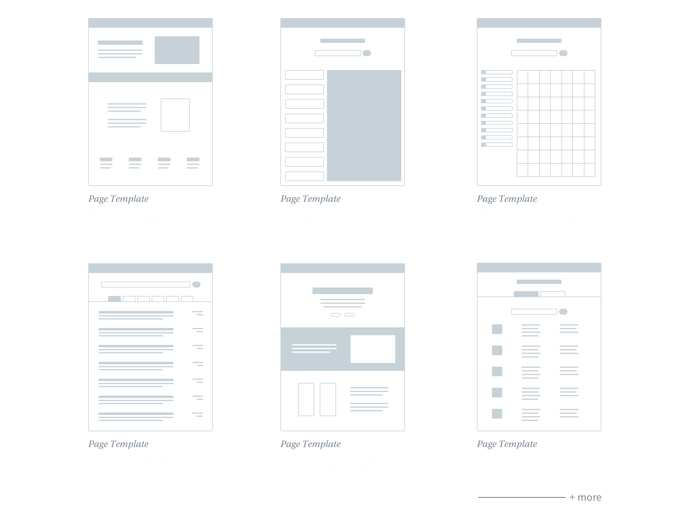
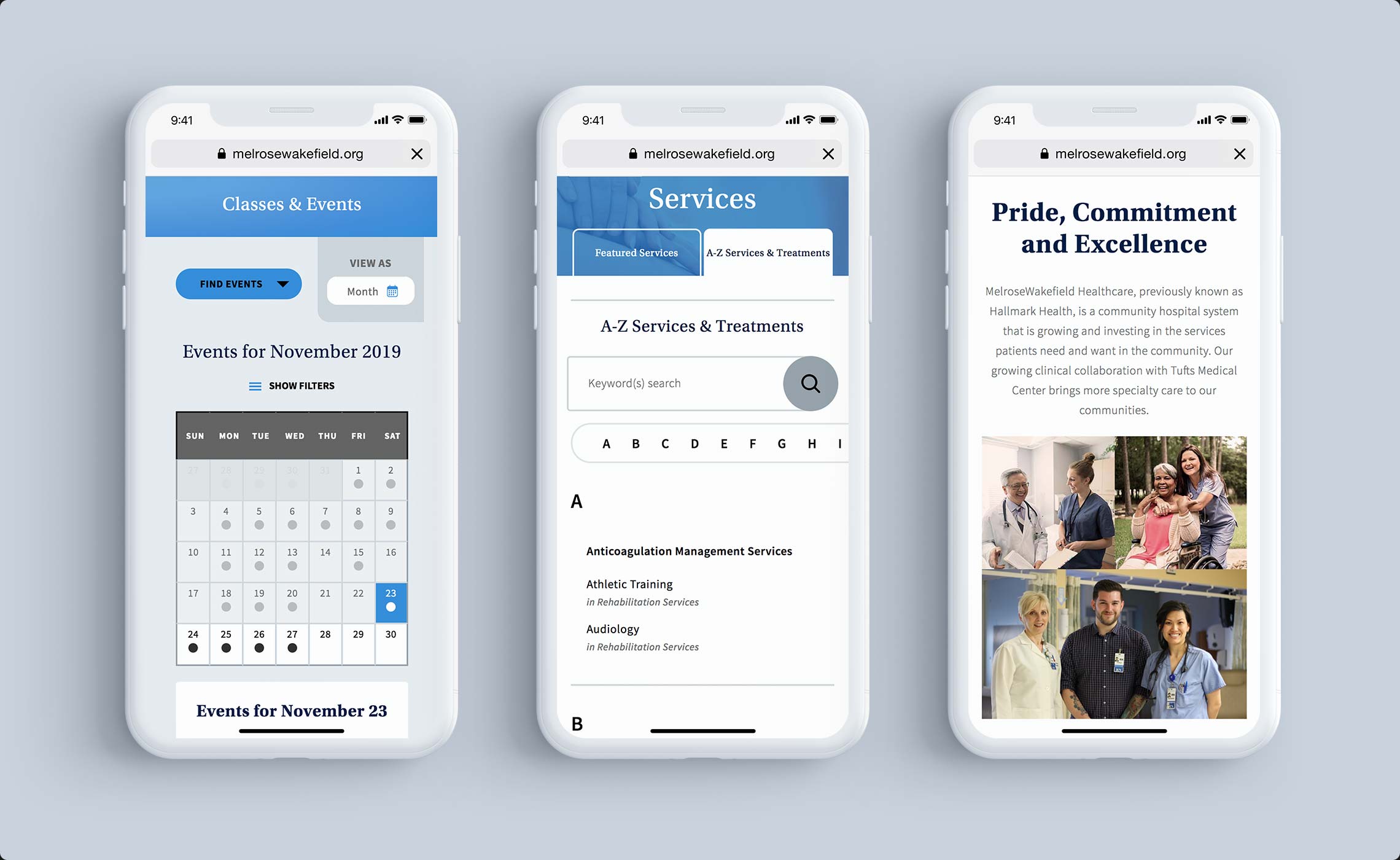
    We created various customized page templates to enable them to easily maintain content. These took into account the variability of content, for example both the addition or absence of sidebars, along with areas for them to add key user actions.

    Fresh experiences

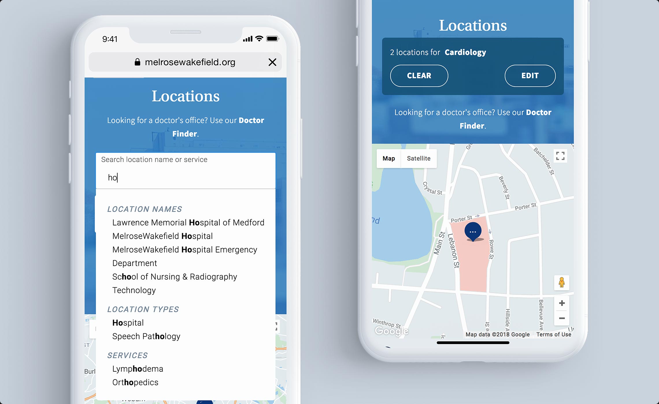
    The new website needed to be a flexible, scalable tool for MW to maintain and grow, but it also needed to stand out in the market. One of many consumer-first experiences we designed was finding the closest medical facility. The search field allows users to search based on location names, types of locations and even by services offered by locations. User’s were also able to share their location to show the closest, most relevant matches.

    Design system

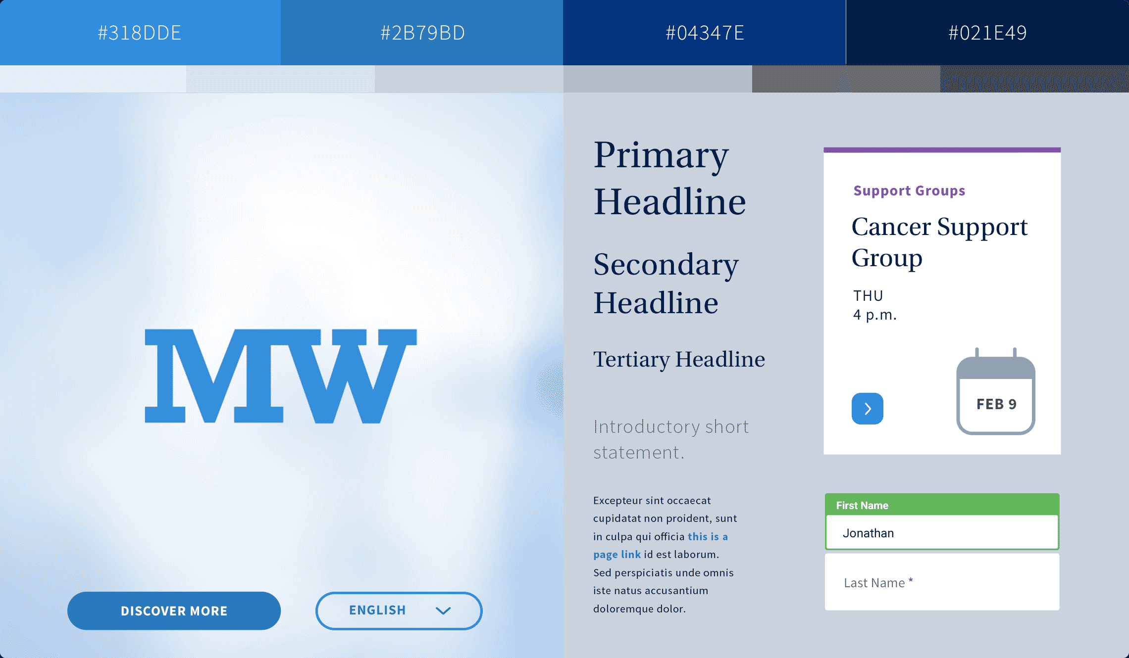
    The website’s design system was founded on their rebranded identity; however, we evolved digital elements for onscreen experiences. The result was clean and simple page designs without distractions and superfluous visual information.

    Results + awards

    The new website received Platinum for Best Site Design of the 2018 eHealthcare Leadership Awards, Silver for Responsive Web Design in the Fall 2018 Digital Health Awards and Gold in the 2019 Lamplighter Awards.

    Better yet, the new website improved access to their healthcare services for the local market, and contributed to successes in business objectives. New site visits increased by 41% and bounce rates decreased on handheld devices, pointing to not just an improved design and branded experience but more importantly a UX that served both our client’s and their consumers’ needs.