National Power
About the project // The National Power Corporation (NPC) had a brand that felt “tired” and was not well recognized in their markets. They needed a bolt of energy into their branding to stimulate brand recognition and competitor differentiation.
Hats worn: Research, Brand strategy, Concepting, Branding, Design
Created at COCG Agency
-
Research
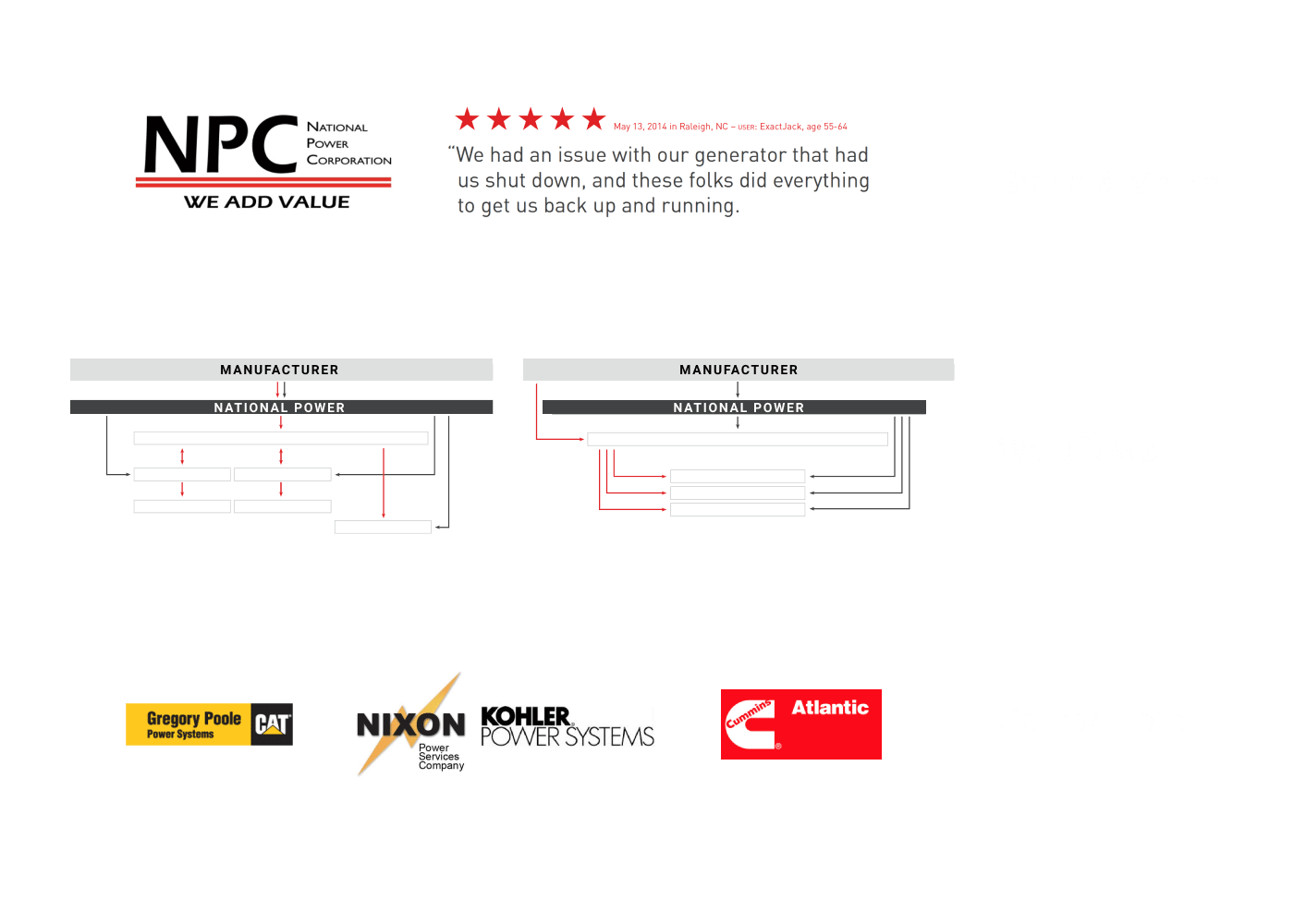
To start, I worked with my team auditing their current brand including analysis of the market’s perception of their current brand. While they had a national sales footprint, they were the only Generac industrial distributor in NC and SC and one of a few Eaton distributors in the area. However, they had a major challenge in differentiation from their competition (including CAT and Kohler distributors) and was using confusing messaging with their target audiences about who they are and what they offer, including an overly broad brand line of “we add value.”
Brand Strategy
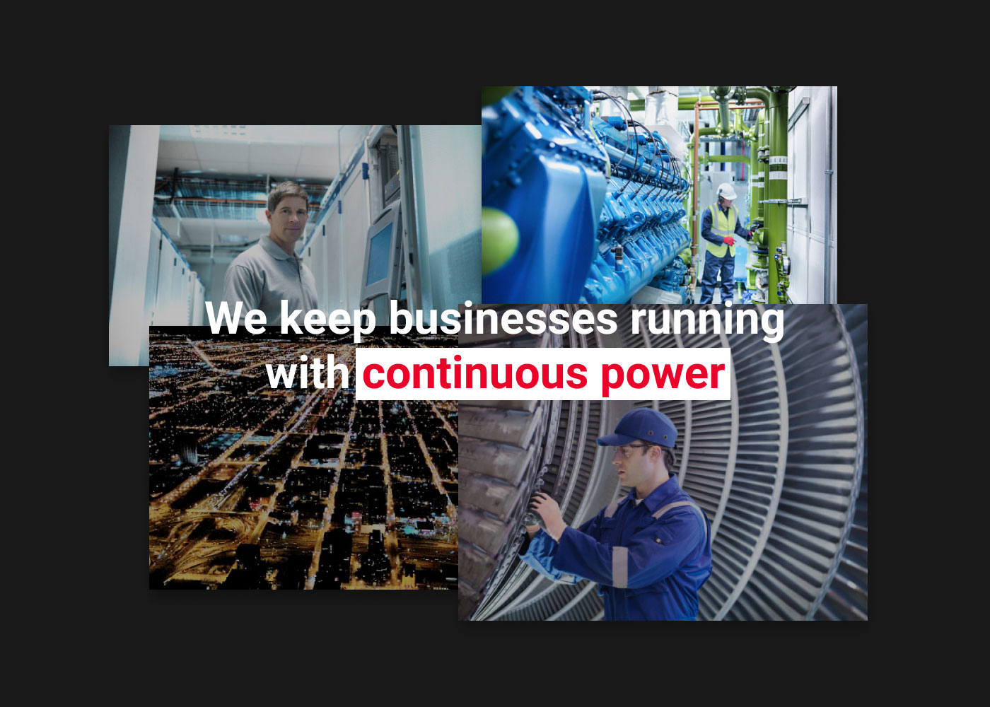
I led interactive client workshops to identify their core purpose, vision, mission, what made them unique and how to express it. We uncovered the underlying “why” it matters what they do day to day. While they are providers of continuous power to industrial business (the “who”), the “why” really hit home: because we live in an age where the electrical grid is unreliable and businesses need protection against unexpected power failures. Therefore their core purpose was simply to keep businesses running with continuous power.
Their newly-found brand attributes of “focused, driven, sharp, agile and methodical” laid a foundation for what would become the visual and verbal expressions of their brand.
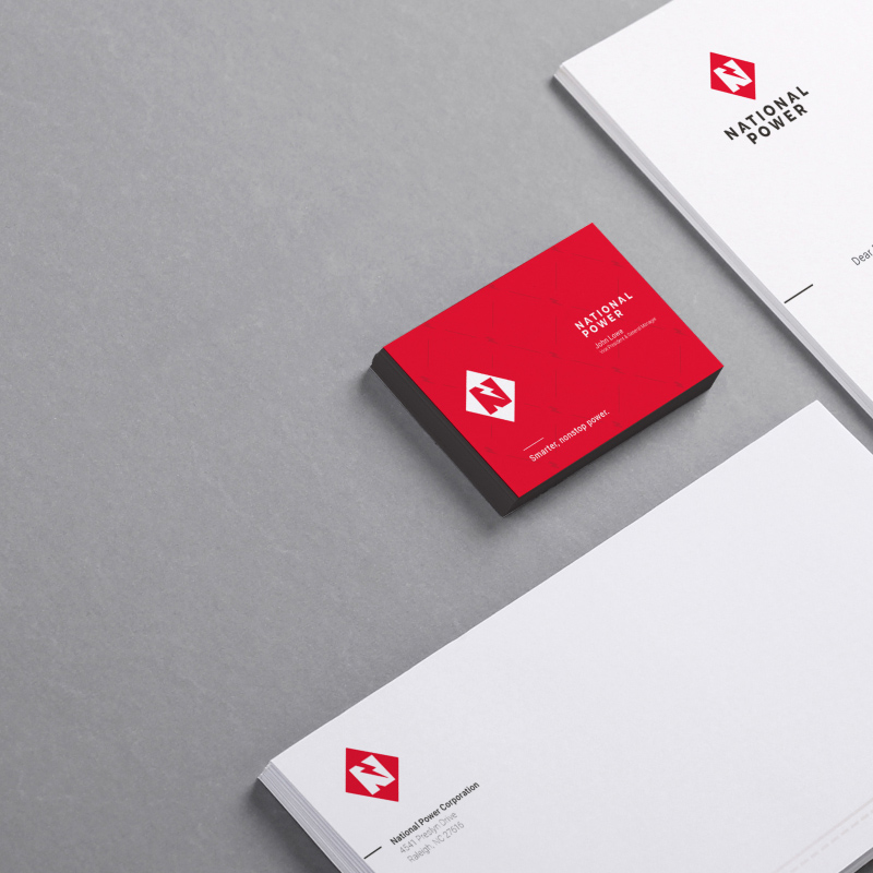
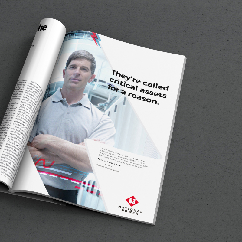
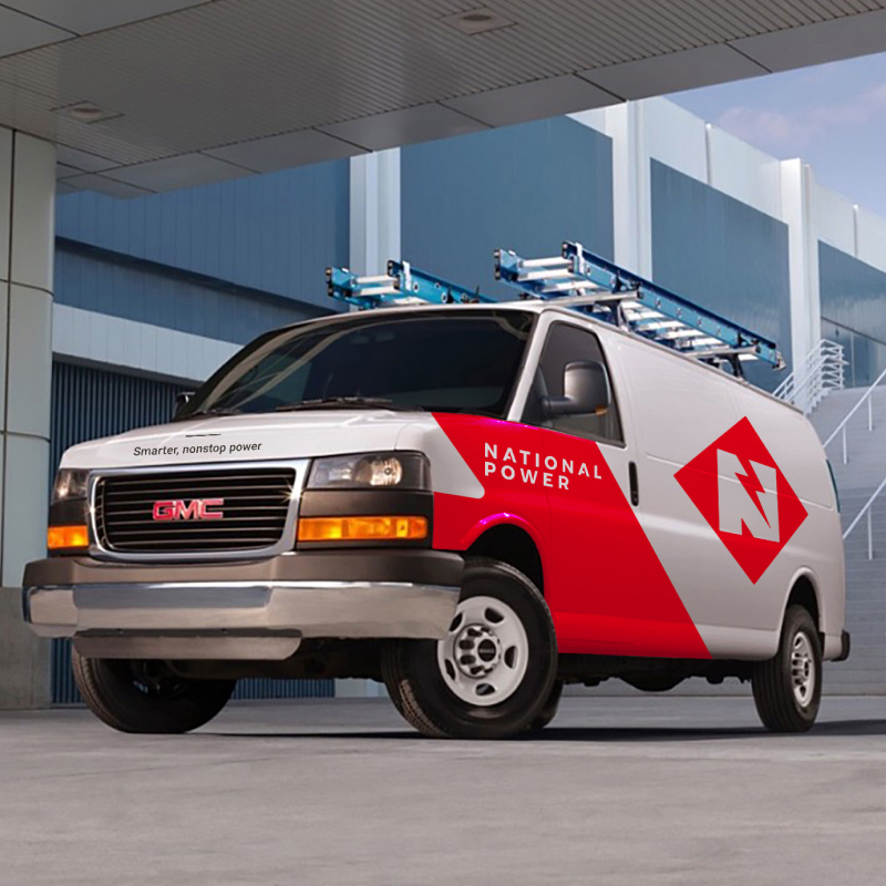
Brand Identity
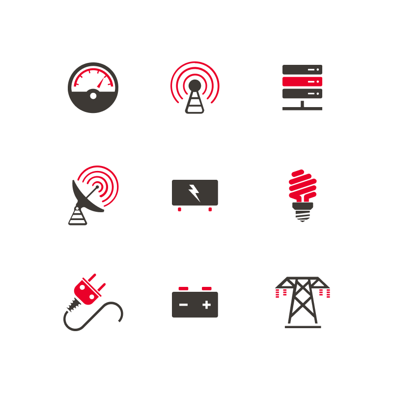
The new direction evolved the company’s previous color palette of maroon and black with an electric red and charcoal black while also introducing secondary colors to support their product offerings. Photography, icons and other visual elements reflect their sharp and agile attributes.
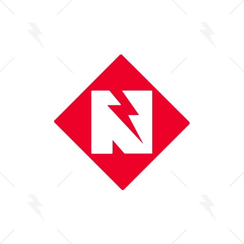
The new brandmark with a simplified name shouts their brand attributes with a bold symbol and refined lettering with attention to every detail. It’s memorable, authentic and stands out among their competitors.