St. Charles Health
About the project // St. Charles Health System is looking to evolve the central Oregon healthcare space with innovative, holistic care and wellness for both individual and communities. As the UX lead, I worked with my team of content strategists and web developers to create a website that would be a unique and centralized place for consumers on this journey.
Hats worn: UX research, UX strategy, Wireframing, Prototyping, UX design
Created at Healthgrades
-
As the primary provider of health care in central Oregon, St. Charles has a well-recognized name in the community. We wanted the new website to provide easy-to-find tools and information for consumers to confidently make the right health decisions.
Wait, who’s the audience?
We started with research, analyzing analytics and CRM data to identify their current audiences and where there was potentially untapped business opportunity. That’s one side of the coin. We also wanted to understand patient and consumer needs, so we studied patient survey results and conducted heat mapping studies. The results provided valuable insights about actions and resources for which people wanted access.

Strategizing together
Through an interactive workshop with chief stakeholders, including C-suite members, we honed in on the project vision and gained a deeper understanding of their market and primary audiences.
A goal refined
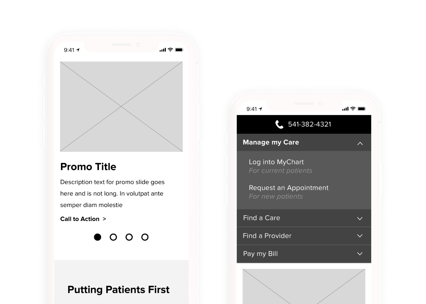
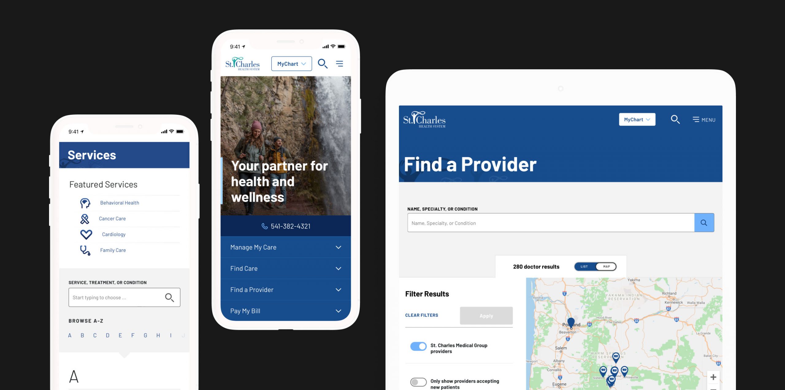
The task? Create a central, integrated experience for patients and caregivers to interact and take action. We built user personas, informed by our UX research, to guide our strategy. The personas guided key design decisions, for example the persistent placement of the patient portal login and simplification of the menu structure.
Flexible structure
By creating clickable wireframe prototypes of mobile and desktop experiences, we were able to assess and prioritize key features. For example the site-wide alert feature, particularly valuable in a crisis, which gives users control to close and re-open instead of losing it when closed.
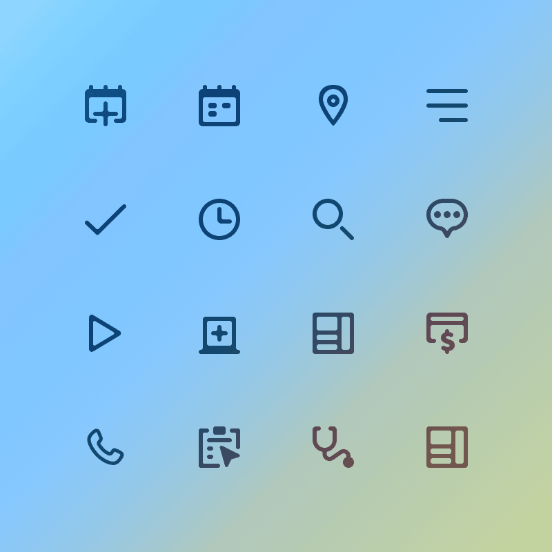
Global Design System
The health system was growing and needed a flexible design system to grow with it. By approaching the design system creation with an atomic design methodology, we crafted each detail to scale. As we built the system, we made it a cloud-based design library to ensure design consistency across the website while laying a foundation for alignment across all digital mediums.
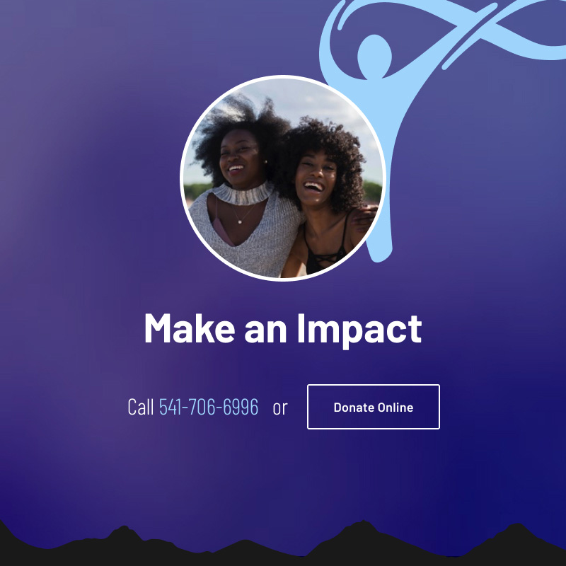
The design system also had to align and flex with St. Charles Foundation, the fundraising arm of St. Charles.
(mostly) Minimal
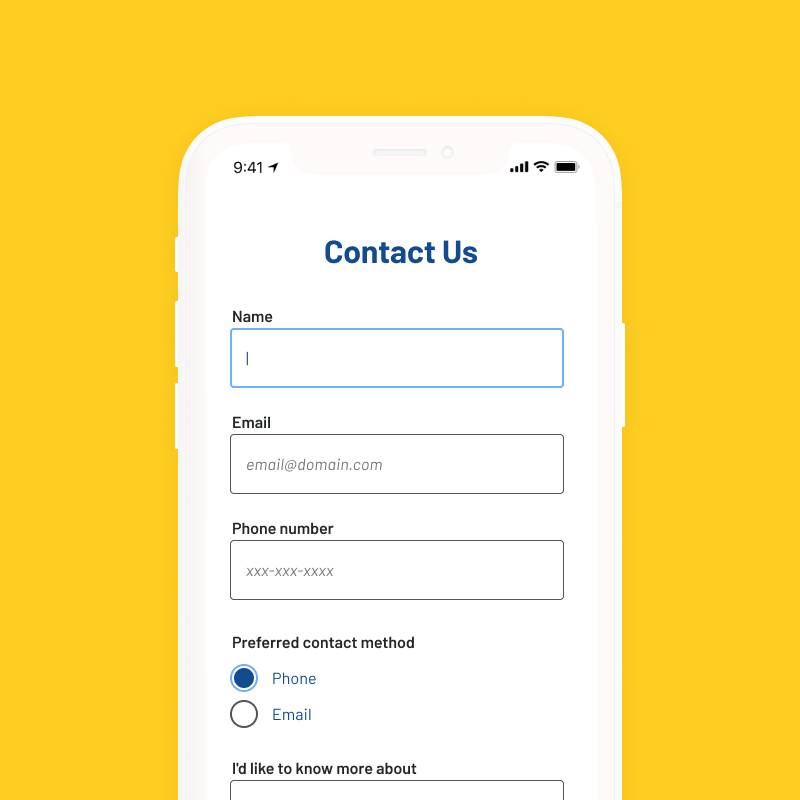
On-page interactions needed to be snappy and smooth, so the design is clean and minimal in order to allow faster page load times and smoother CSS transitions as users interact with toggles, menus, buttons, etc. This minimal approach was particularly beneficial for mobile, where we wanted avoid animation lags due to slow connection or old browsers. And yet, we didn’t want the site to be sterile and void of their personality, so we found opportunities to infuse uniqueness with subtle visual elements.
Purposeful
Design isn’t about making things “look pretty” but about making useful things. Design decisions were made with the user’s needs in mind. We asked questions like “does this help a user improve their health?” and “does this site architecture reduce steps for a user to accomplish their action?”
It’s not the end
St. Charles Health System saw strong results after the new website launched. When we compared the period after the site launch to the same period of the previous year, overall, the number of users increased by 85%. New users increased by 95%. Unique page views increased by 55% and entrances by 73%. What’s even better was that mobile saw the biggest boost with a traffic increase of 134%!
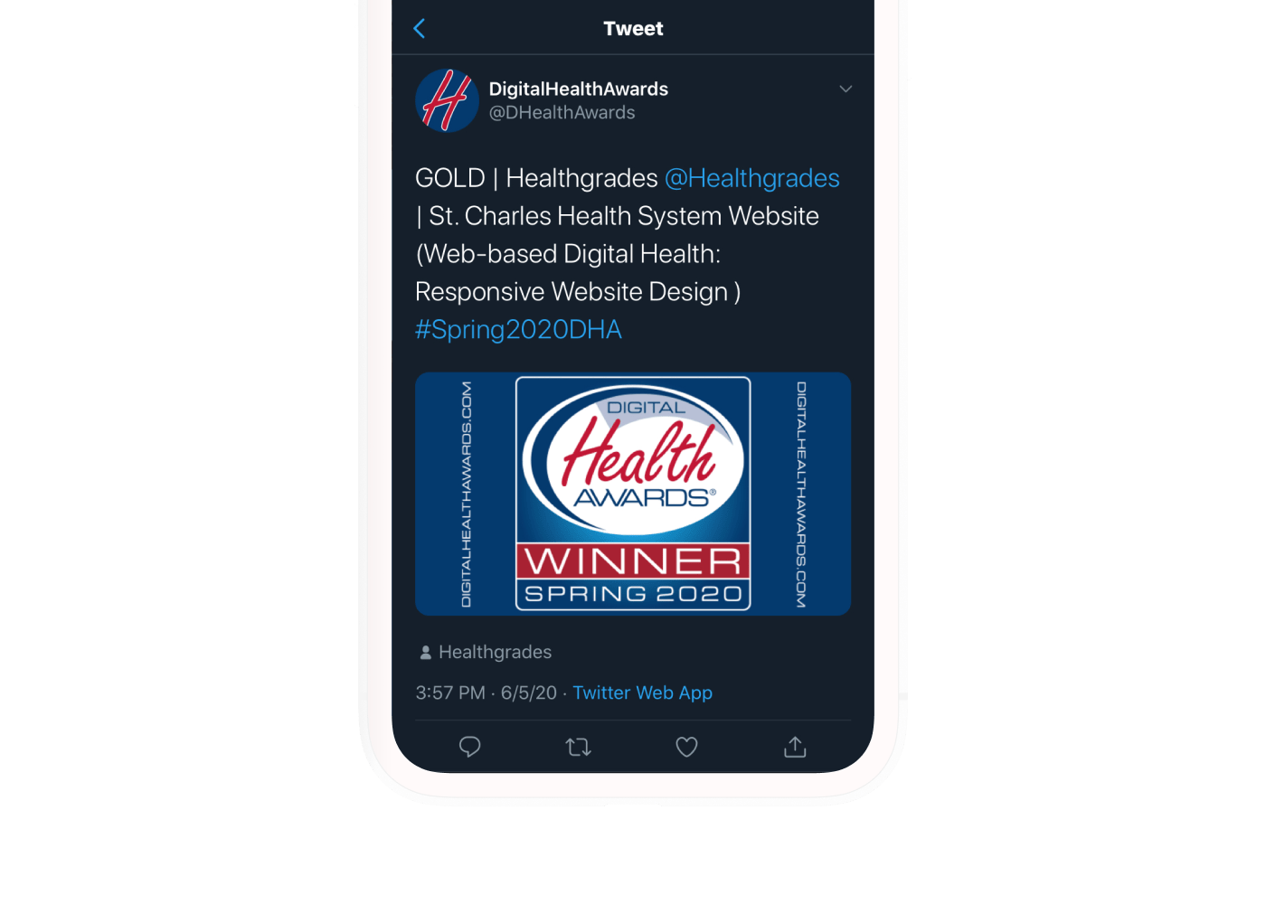
Award
The new website was awarded the top honor of Gold for Responsive Web Design in the Spring 2020 Digital Health Awards.