Triangle Brick
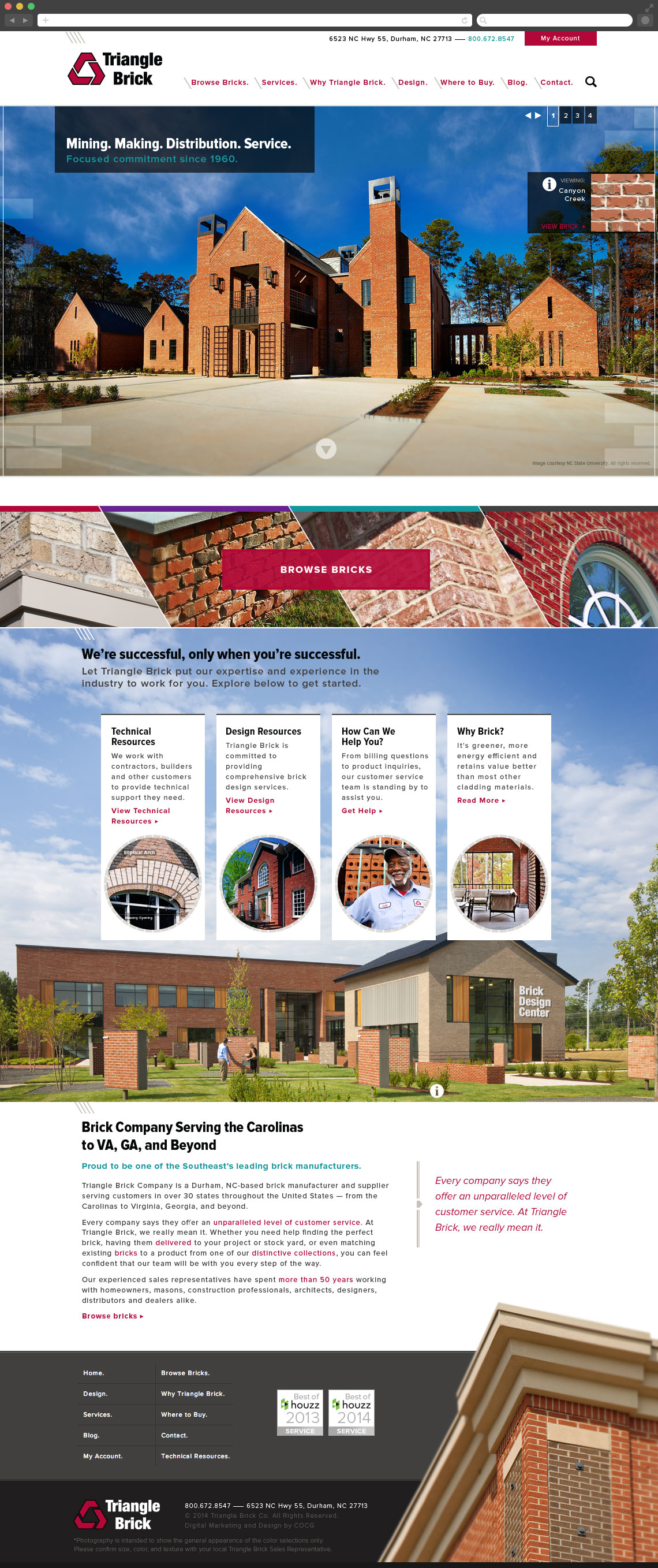
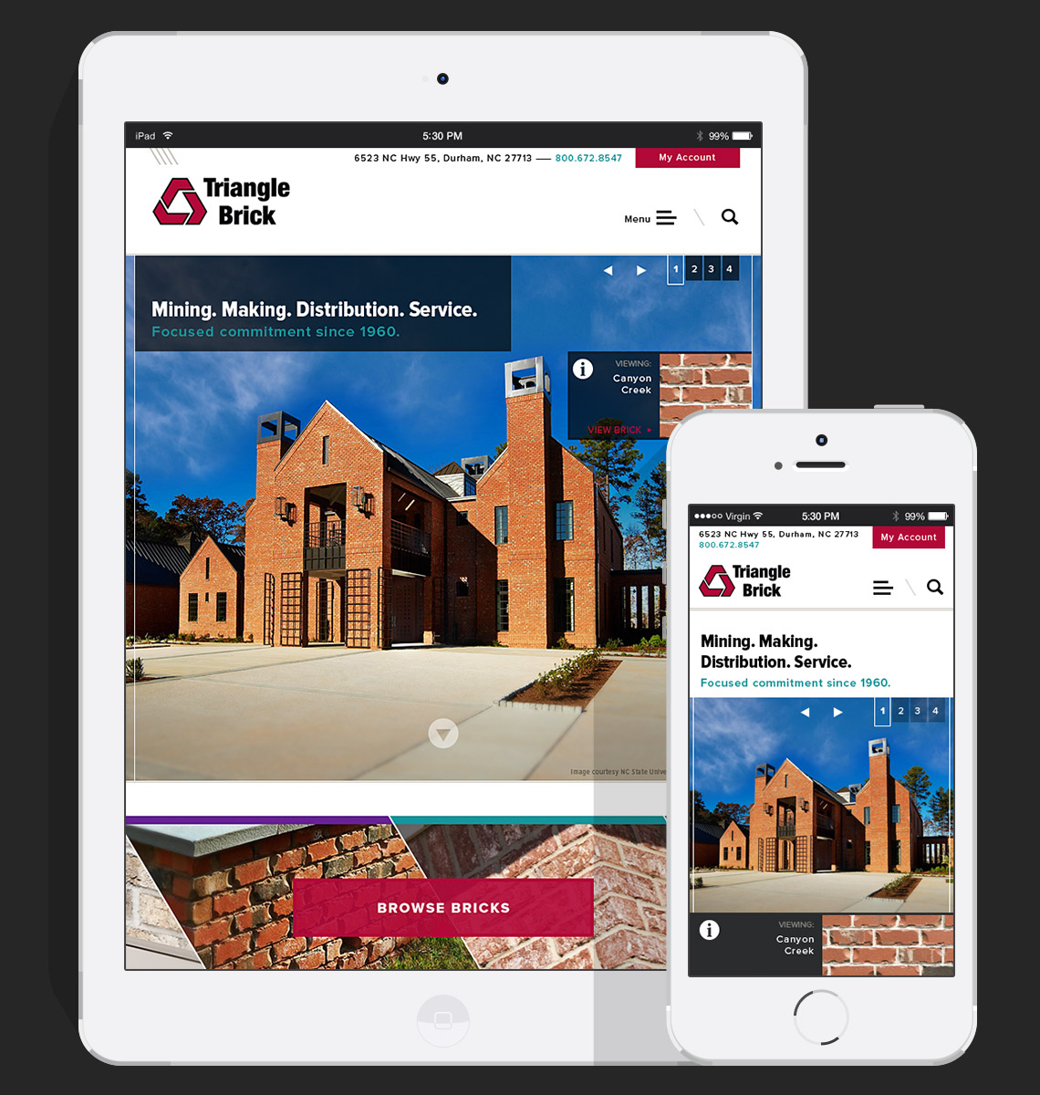
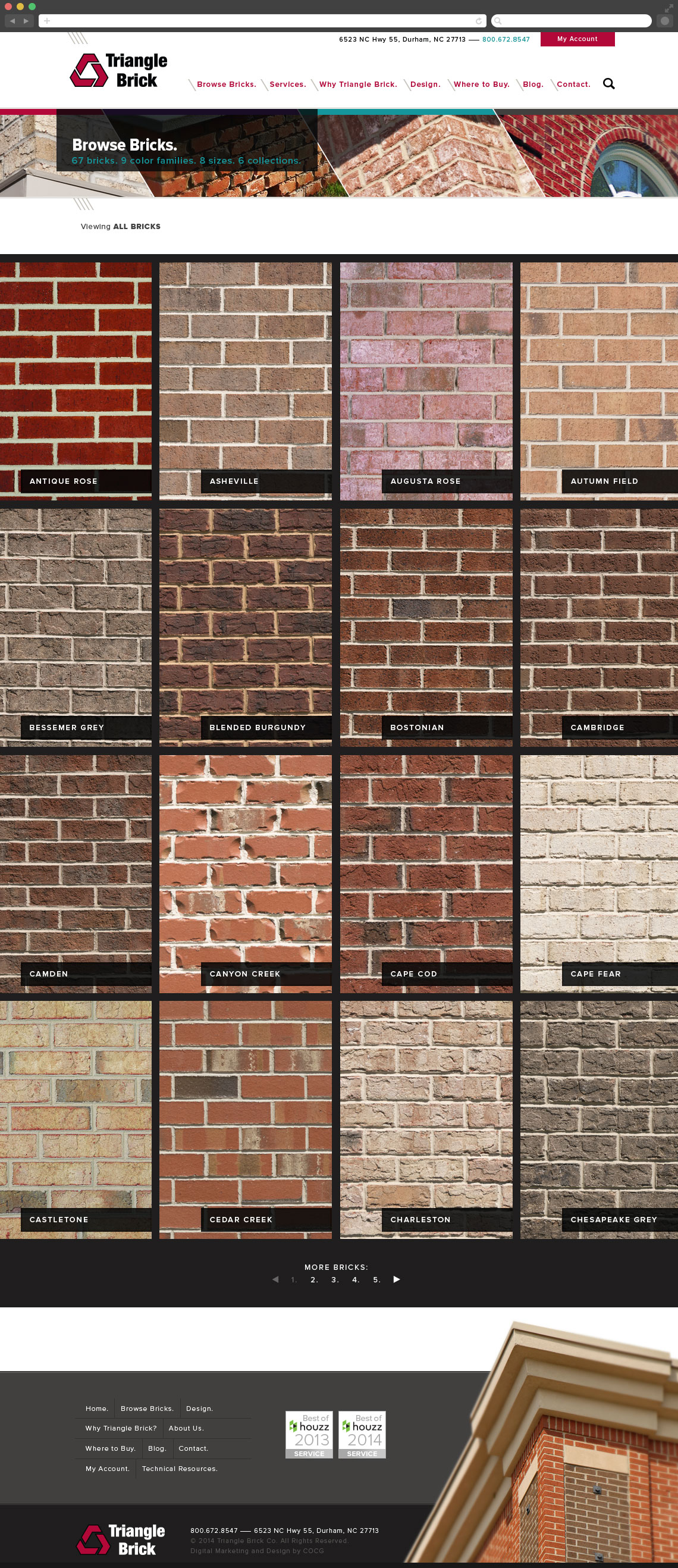
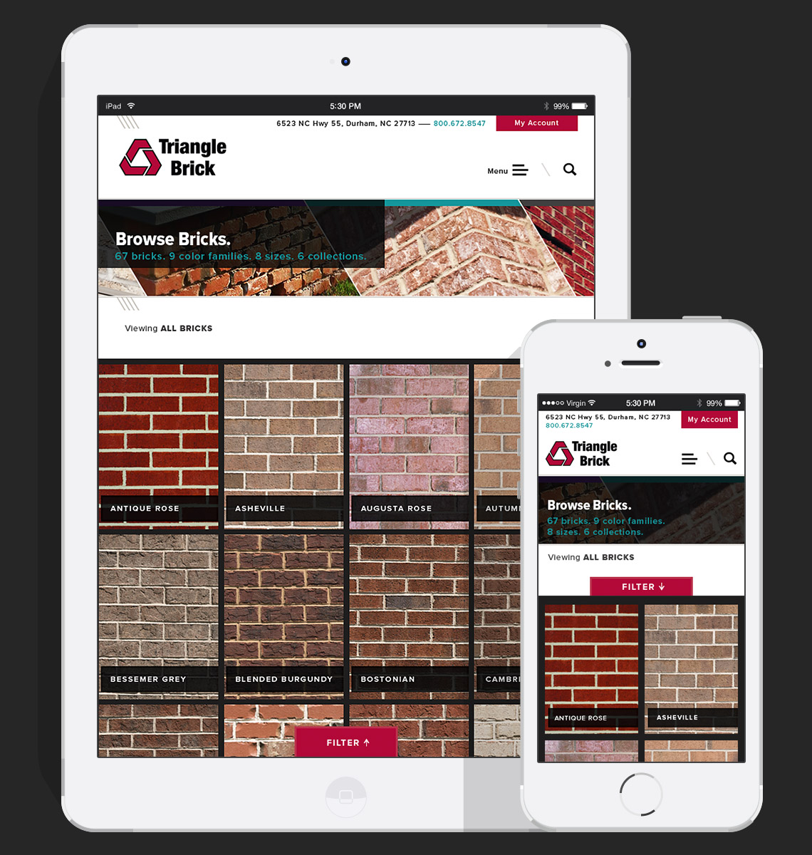
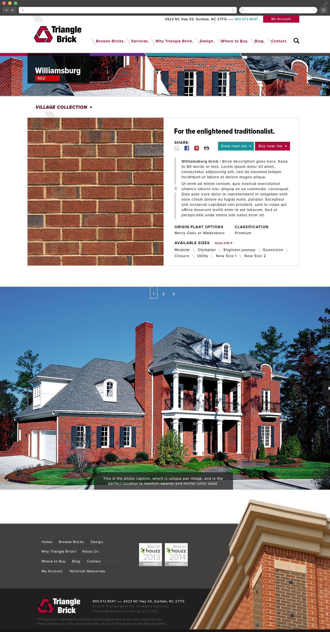
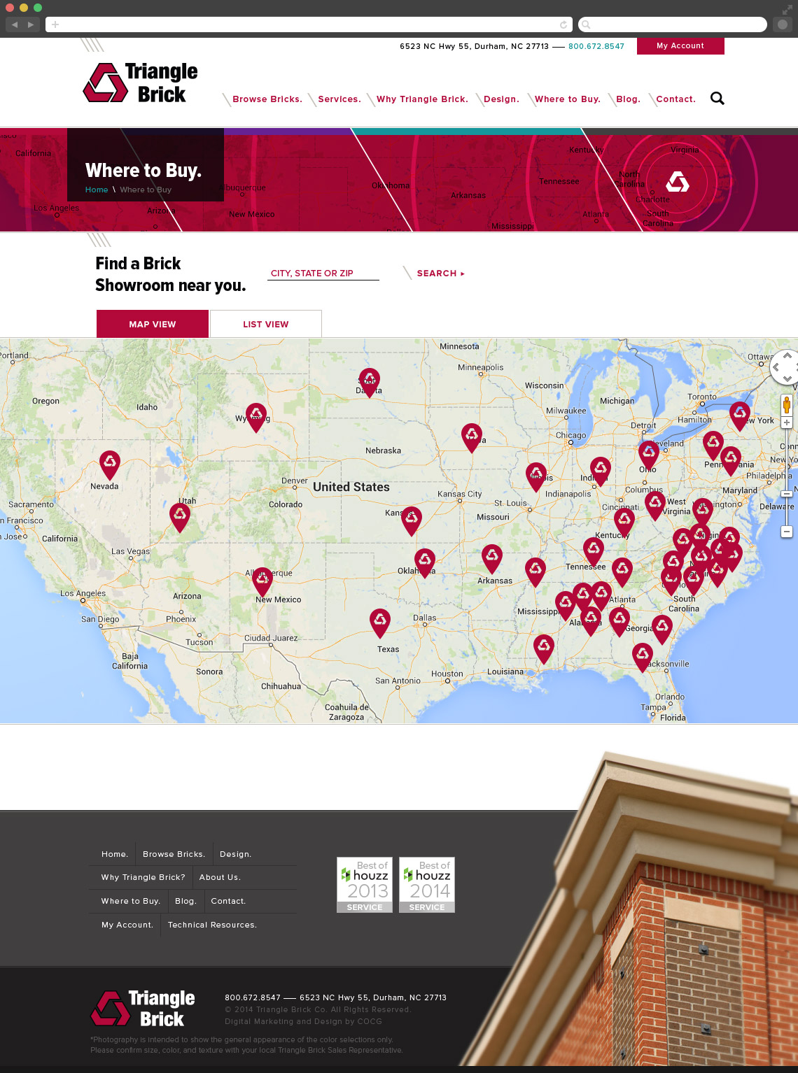
Brick is beautiful, bold and lasts more than a lifetime, and the design of this site needed to reflect these sentiments. The home page slider shows off application photos of real buildings using their bricks and points the user directly to the brick profile page. Users can also browse bricks and filter them in a shopping-like experience. What if someone wants to see the brick in person? Easy! Users can find a dealer (there a LOT around the USA) or even find a house that is built with that brick, in a 5, 10, 25 mile radius (user chooses how far to drive). The colors and brand expression were created to elevate the company’s look and feel, while complimenting the brick’s natural textures and shades.
Hats worn: UX Research, Concepting, Visual design, Art director
Created at COCG Agency
